Zukunftsperspektiven
A future-oriented, modular design system for a visionary urban project
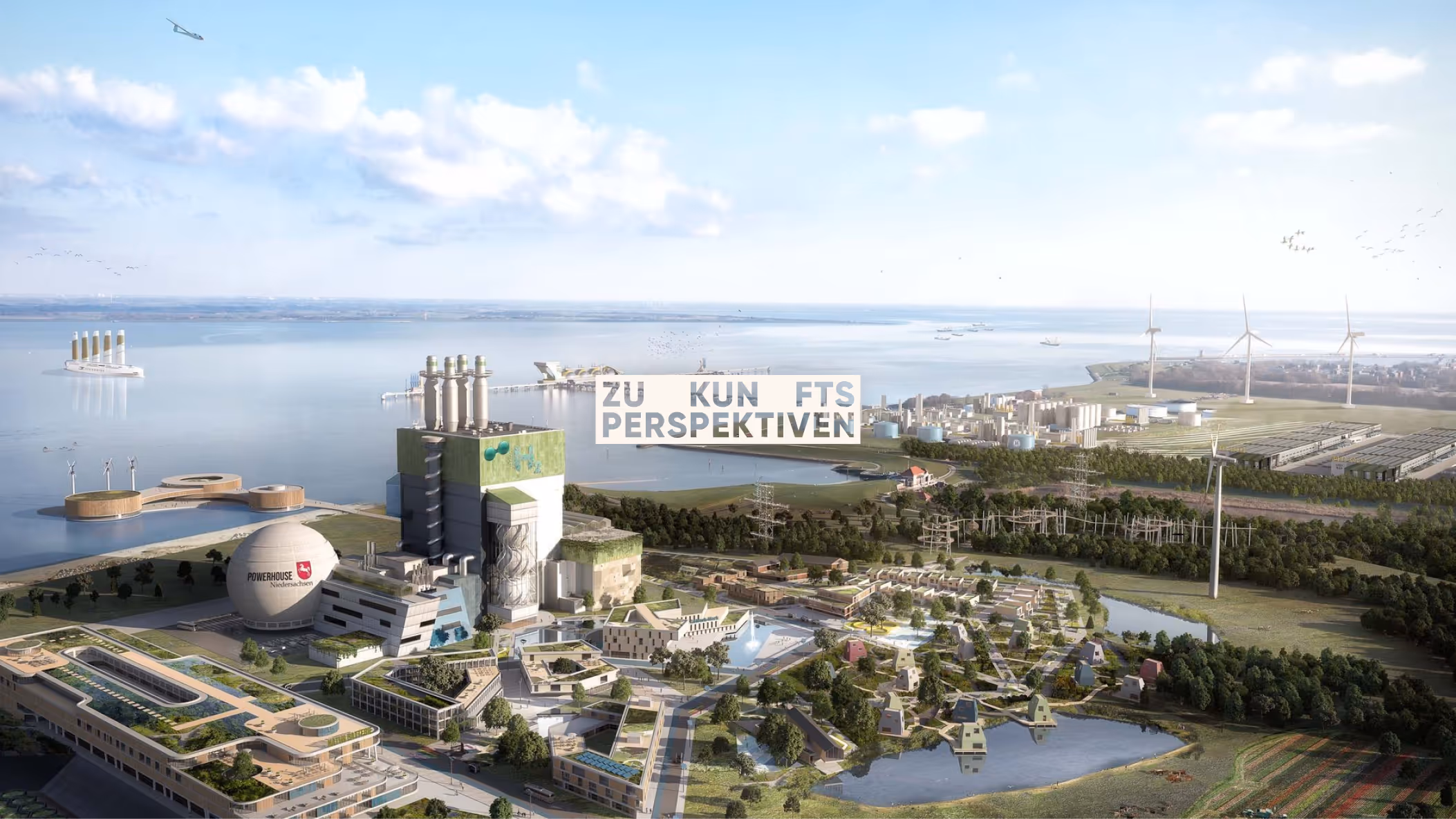
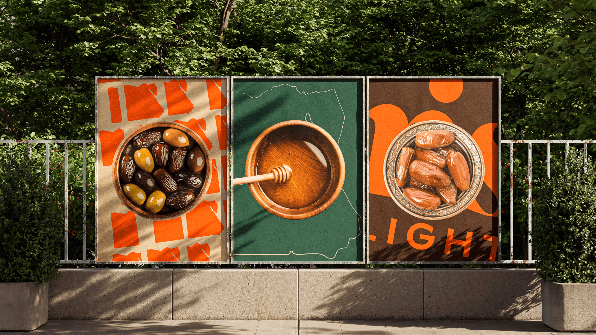
The project Zukunftsperspektiven ("Future Perspectives") by architecture firm Loomn Dares to look ahead precisely this way. In Collaboration with city Planners, photorealistic visions of sustainable German cities are created, as concrete visions of the future that make change tangible. A creative side project became a powerful, socially relevant initiative. It was time to make a brand out of it.
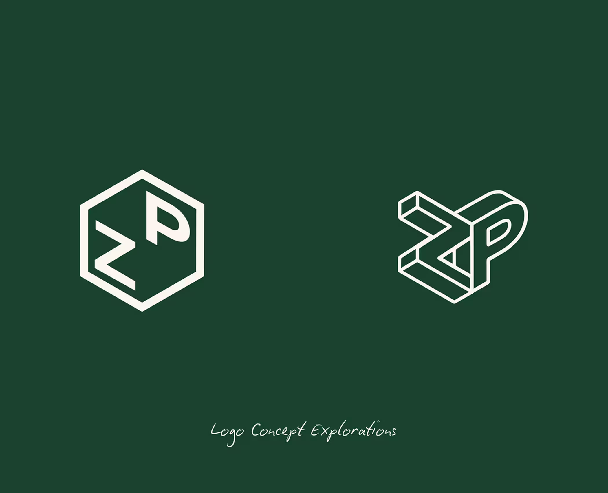
The visual identity should be more than just recognizable; it should show attitude. The name Future Perspectives was taken literally. Initially, we tried to creatively implement the term “perspectives.” Although this led to exciting results, it was ultimately too obvious and predictable. Instead, the focus soon shifted to the actual core of the project: the future. What does the future mean in visual language? Openness, potential and thinking in terms of possibilities.
.avif)
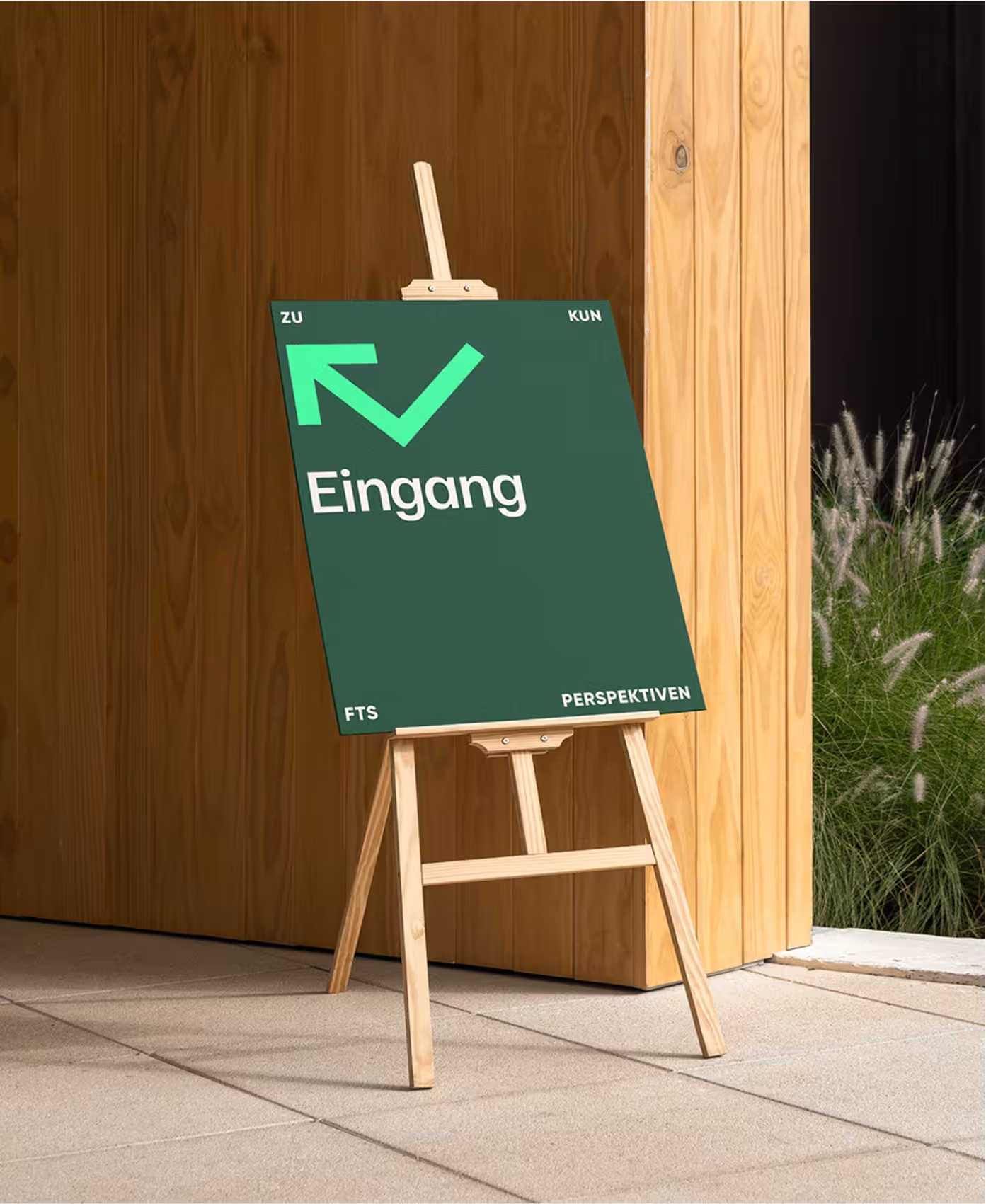
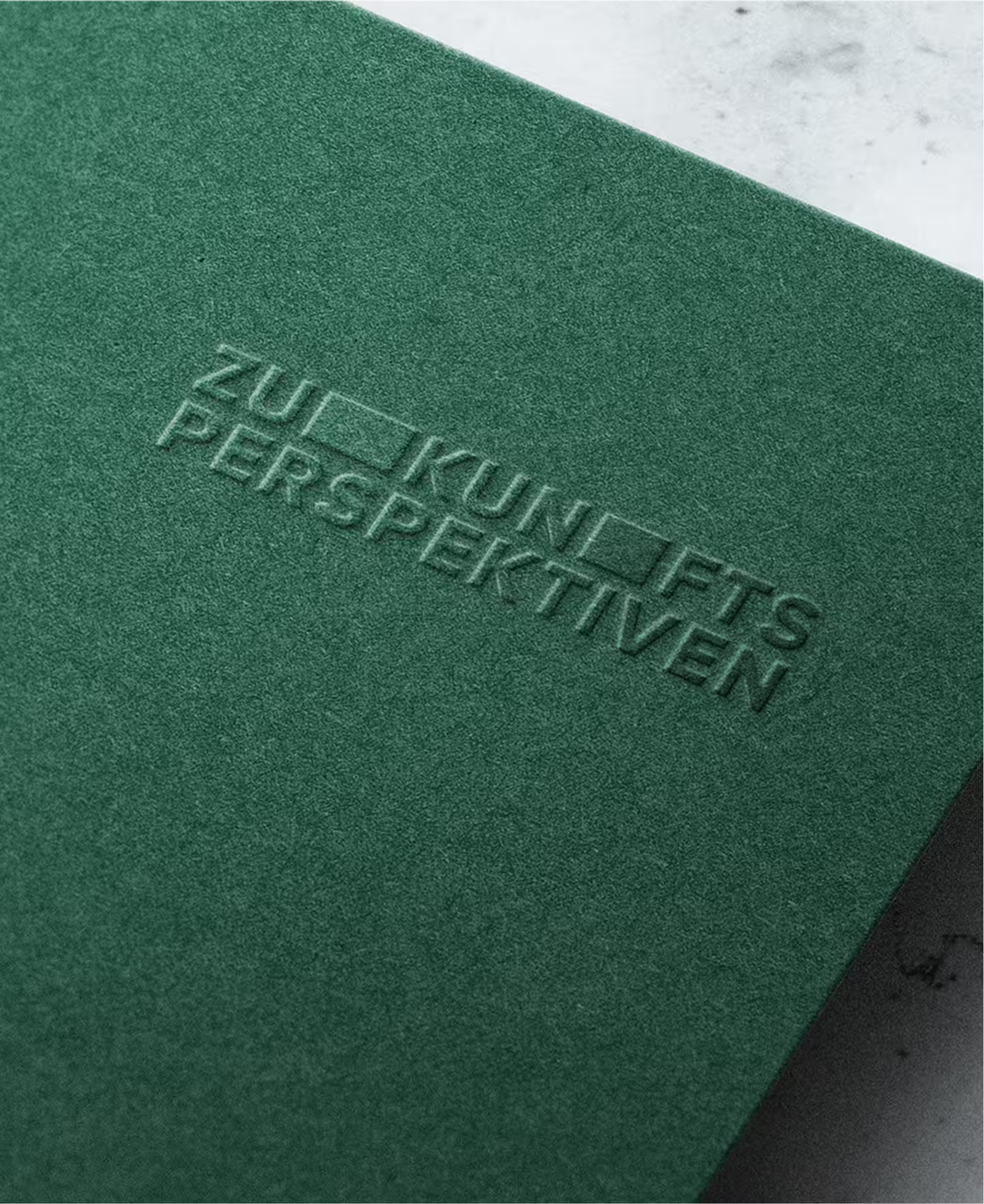
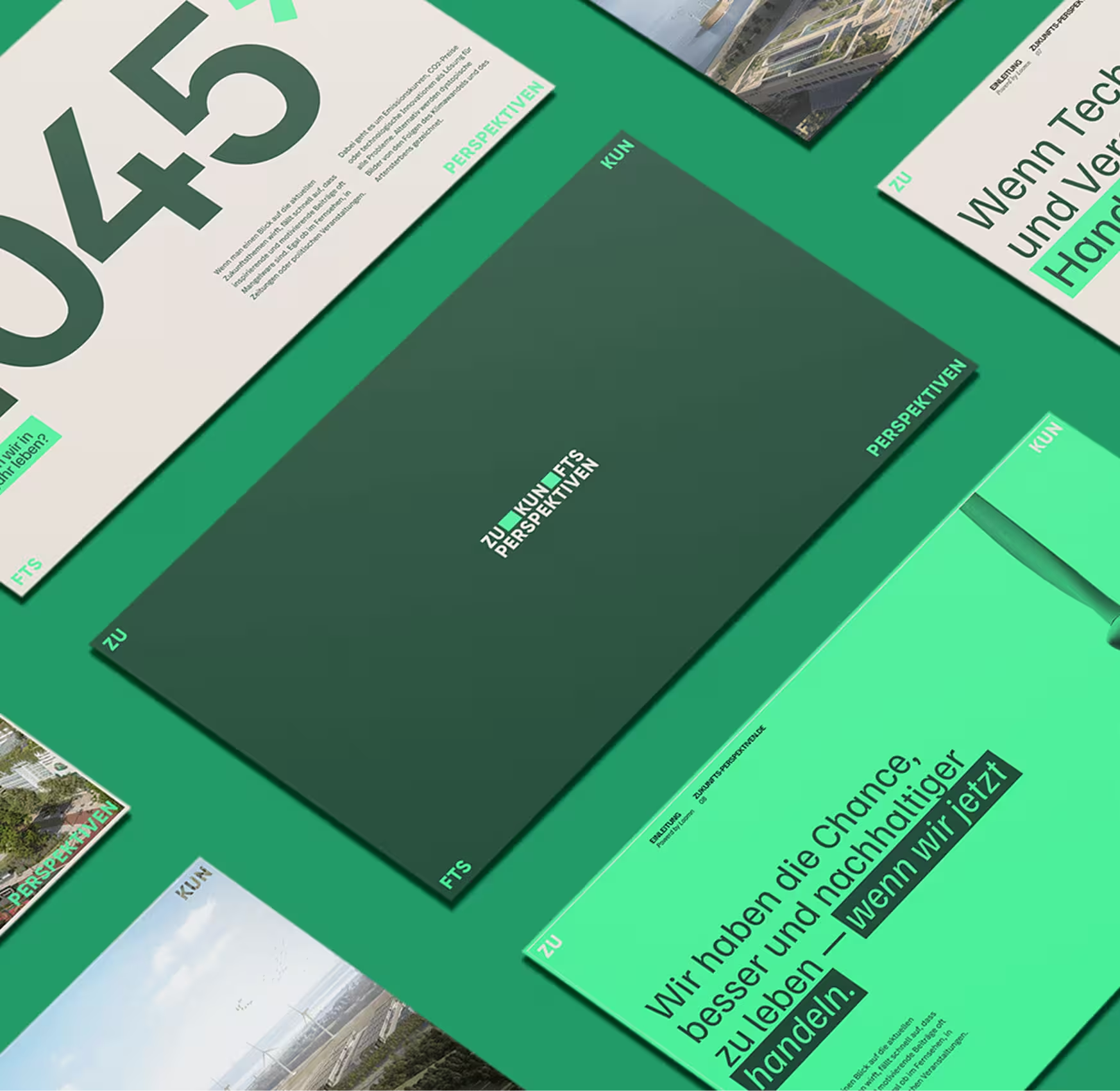
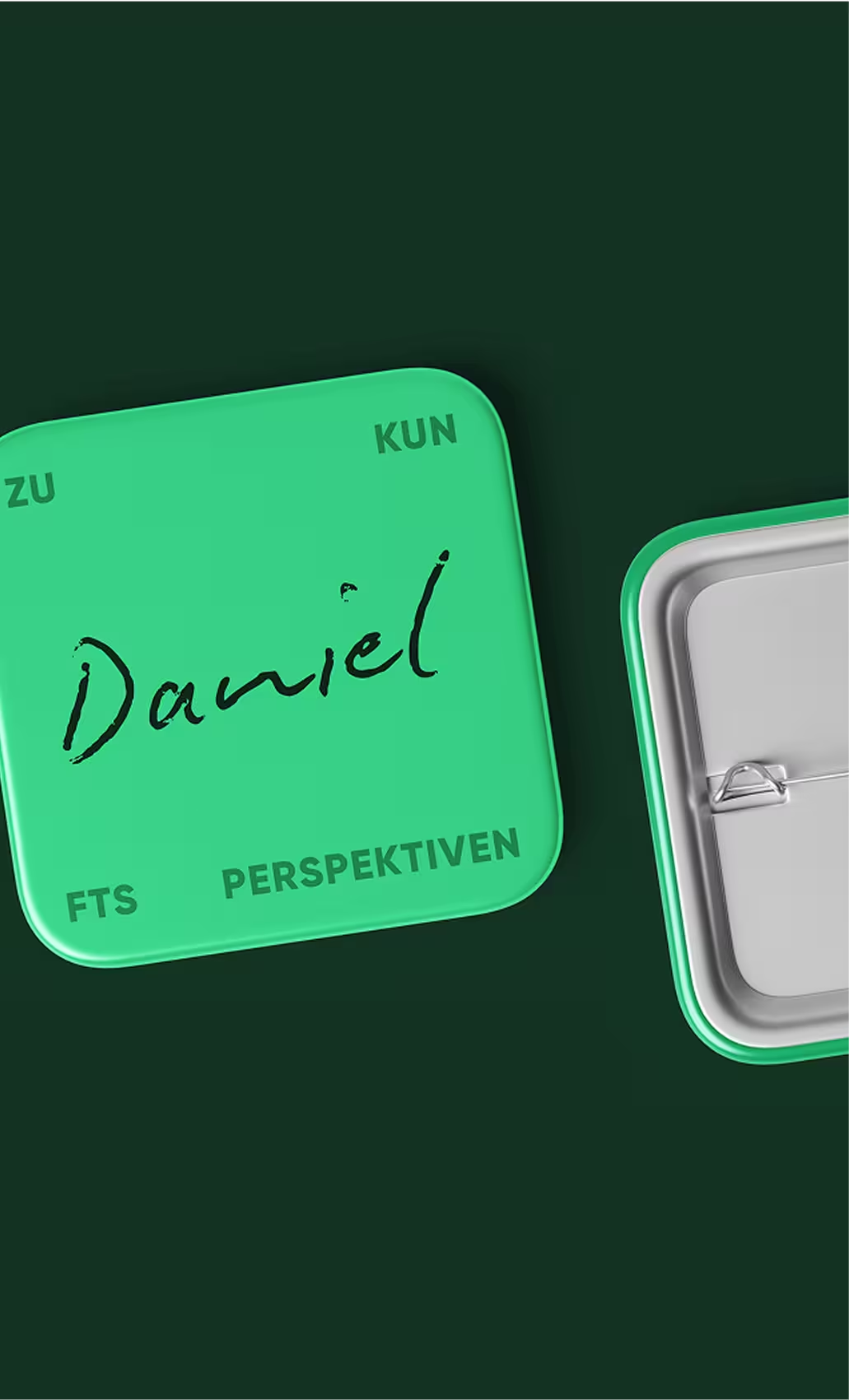
We translated this idea into a logo that deliberately leaves room: white space as an invitation for ideas. The brand name becomes an open block that conveys structure and lightness at the same time. In application, this unity breaks up, is spread over the four corners of a medium; an abstract reference to space, direction and dynamics.
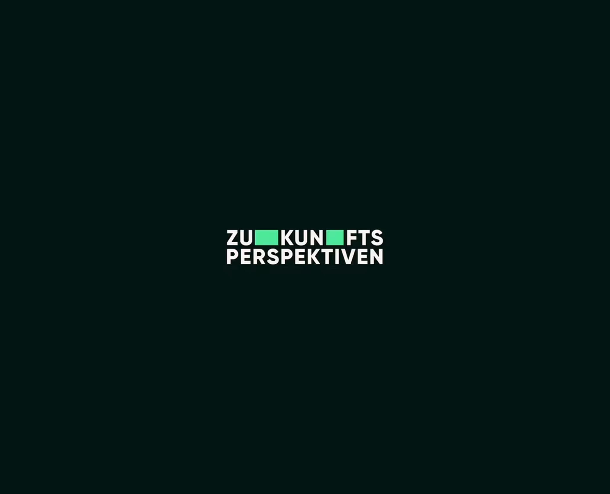
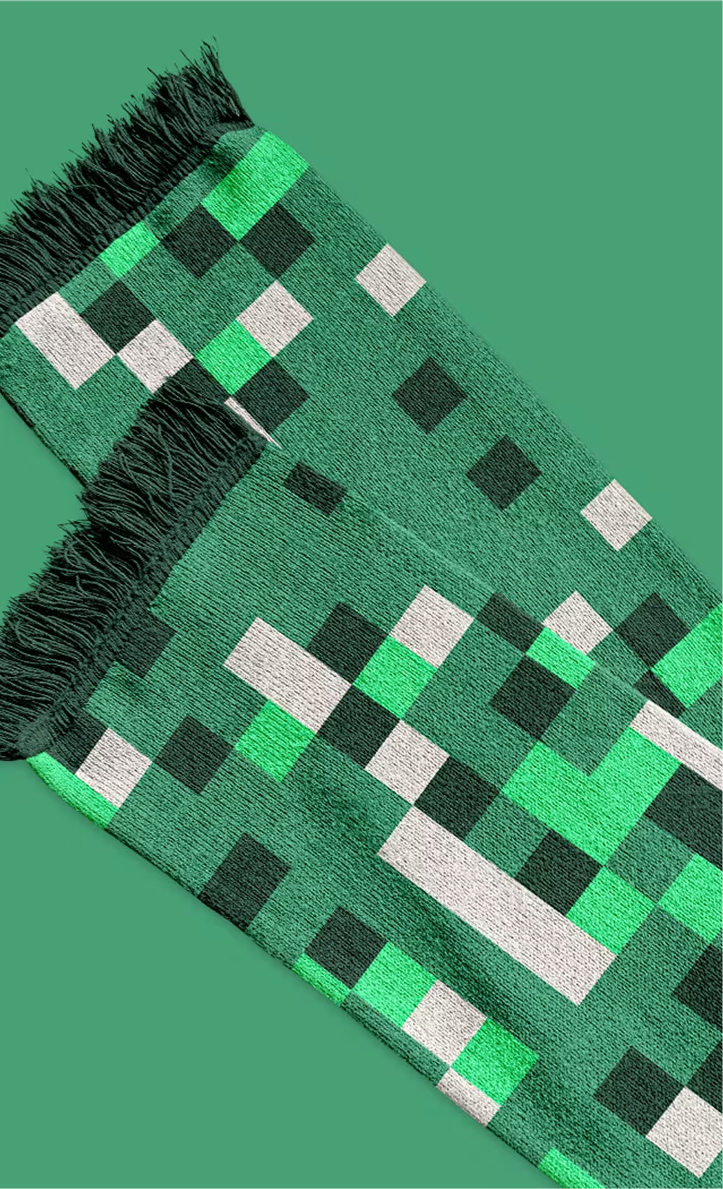
The design thrives on contrast: a deep british racing green symbolizes grounding and sustainability, while a powerful purple brings innovative power and utopia into play. A reduced square — the “pixel” — functions as a flexible brand pattern, a favicon or interface module. The typography is discreetly restrained, but convey's technical clarity and future thinking.
Today, future prospects appear as an independent brand; with clear recognition and increased visibility. It creates a flexible, modular stage for content and ideas and makes the project's attitude noticeable in every application: structured, open, future-oriented. A brand that not only shows what is possible, but also inspires you to think ahead.
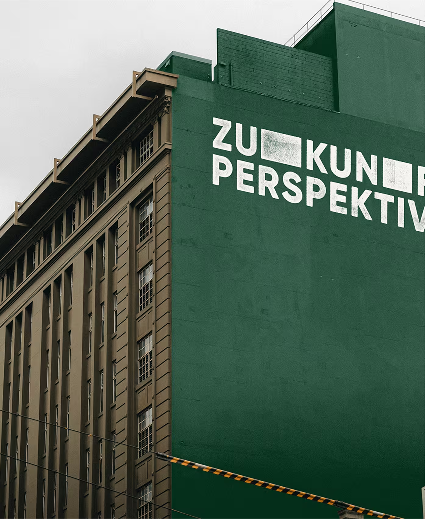
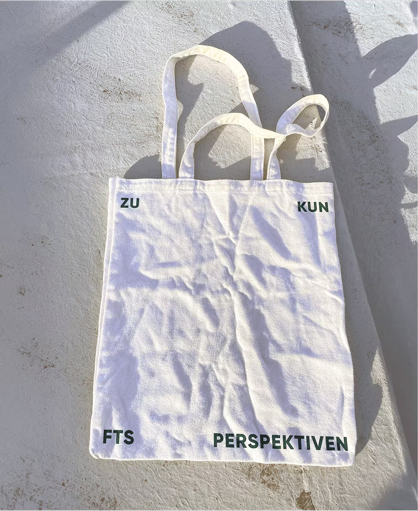
We translated this idea into a logo that deliberately leaves room: white space as an invitation for ideas. The brand name becomes an open block that conveys structure and lightness at the same time. In Application, This Unity Breaks Up, Is Spread Over the Four Corners of a Medium; an Abstract Reference to Space, Direction and Dynamics.
The Design Thrives on Contrast: A Deep British Racing Green symbolizes grounding and sustainability, while a powerful purple brings innovative power and utopia into play. A reduced square — the “pixel” — functions as a flexible brand pattern, a favicon or interface module. The typography is discreetly restrained, but convey's technical clarity and future thinking.
Today, future prospects appear as an independent brand; with clear recognition and increased visibility. It creates a flexible, modular stage for content and ideas and makes the project's attitude noticeable in every application: structured, open, future-oriented. A brand that not only shows what is possible, but also inspires you to think ahead.
We translated this idea into a logo that deliberately leaves room: white space as an invitation for ideas. The brand name becomes an open block that conveys structure and lightness at the same time. In Application, This Unity Breaks Up, Is Spread Over the Four Corners of a Medium; an Abstract Reference to Space, Direction and Dynamics.