10HOTELS
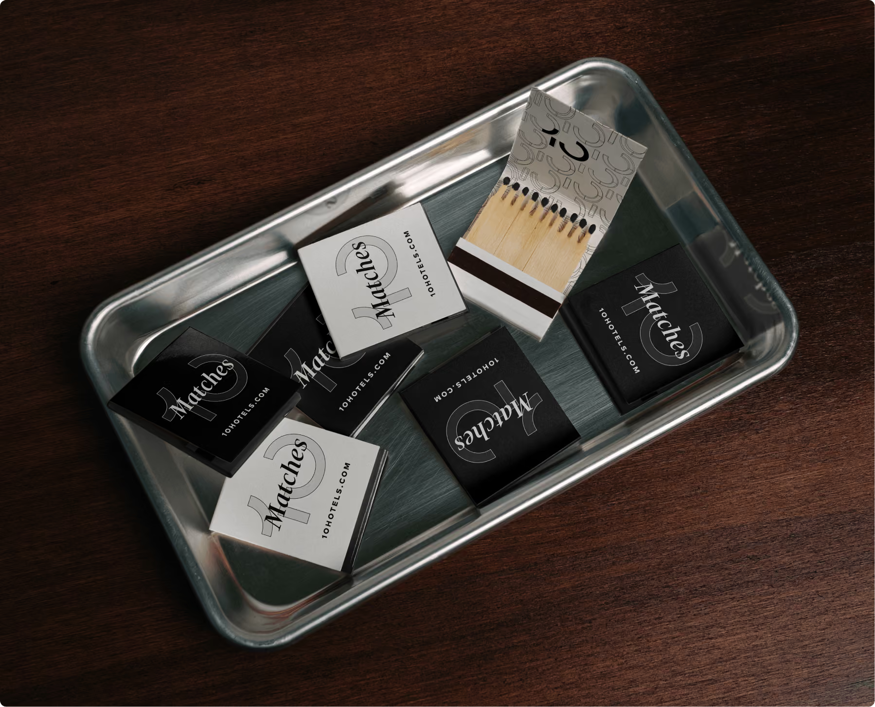
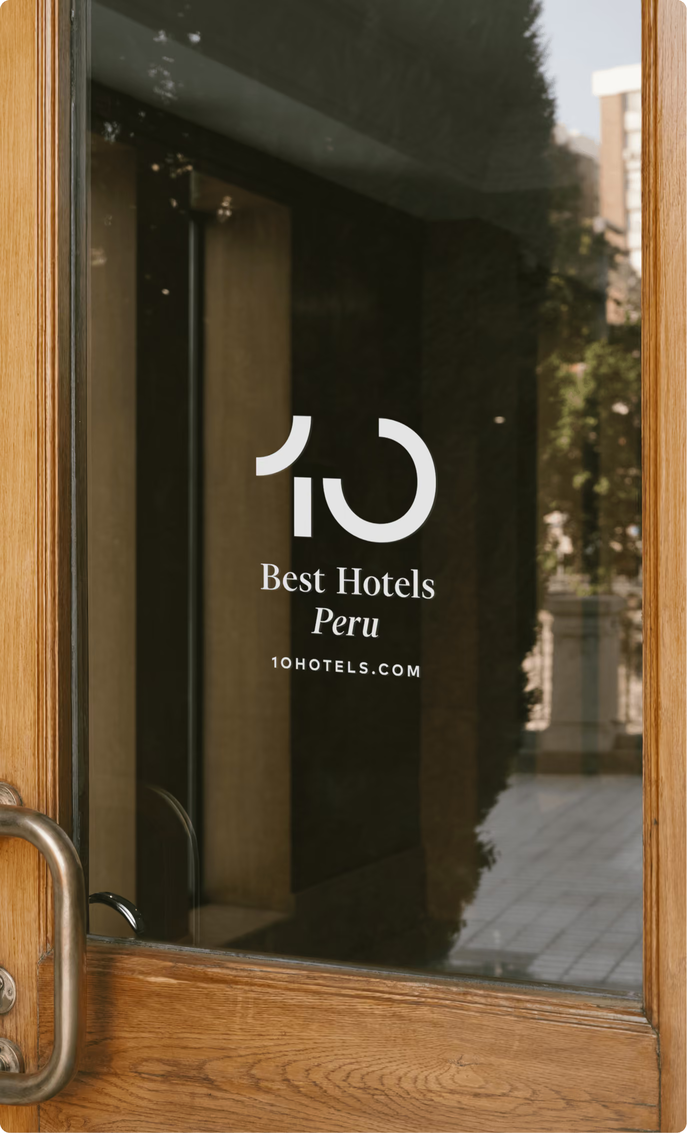
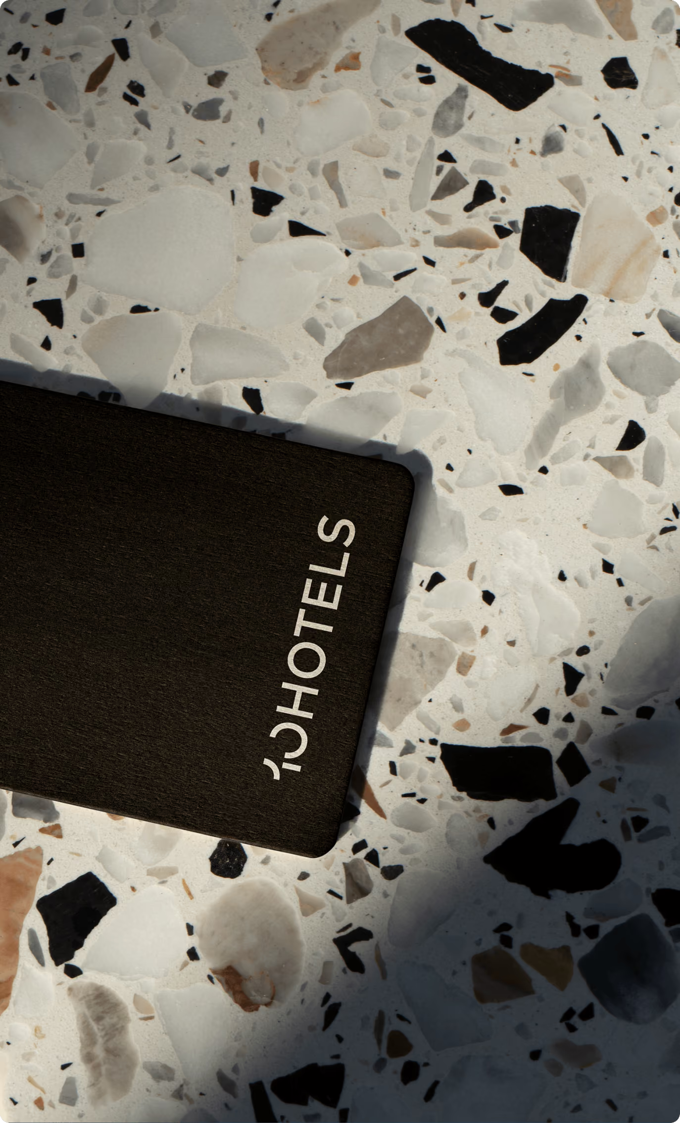
A harmonious logo featuring an iconic number for 10HOTELS
I have rarely been so close to a eureka moment
Traveling is one of life's true joys. Yet, with the sheer endless array of options, finding the perfect accommodation can quickly feel like looking for a needle in a haystack. This is exactly where the carefully crafted rankings from 10HOTELS come in: a reliable compass to the 10 best hotels, resorts, and lodges at any destination, curated by a team of travel enthusiasts and hotel experts.
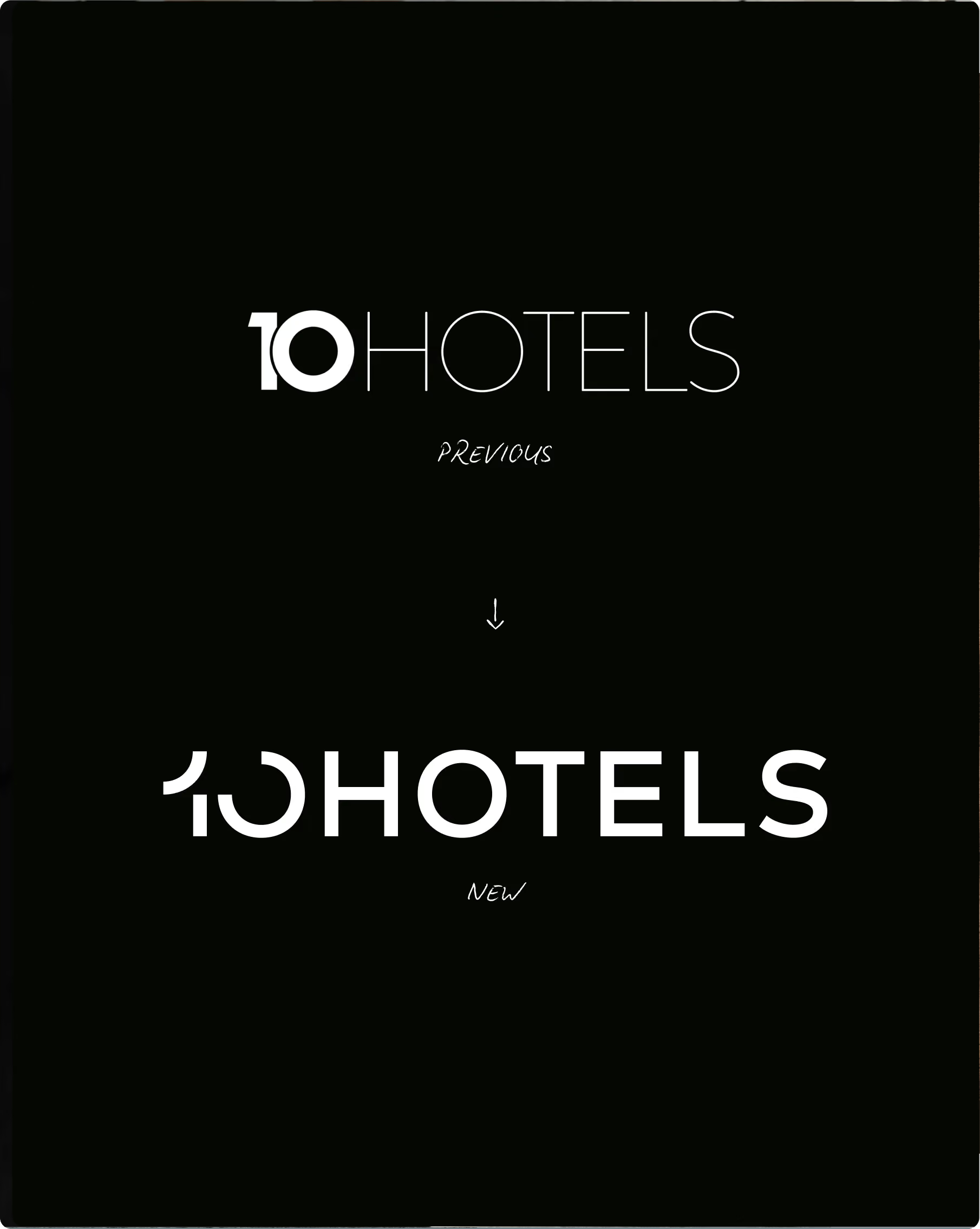
Before we started working together, 10HOTELS had handled everything in-house. But when it came to the logo, the spark just wouldn't catch. Previous drafts felt too sterile, generic, and typed rather than designed. The team faced a specific challenge: the number "10" needed to not only integrate harmoniously into the "10HOTELS" wordmark but also function as a standalone, striking icon.
Too simple requirements
A true masterclass in design tightrope walking. After all, in the Latin alphabet and among Arabic numerals, there is hardly anything simpler or more inconspicuous than a one and a zero. A line and a circle. Two shapes that could hardly be less distinctive. Utterly arbitrary. The anti-logo, if you will.
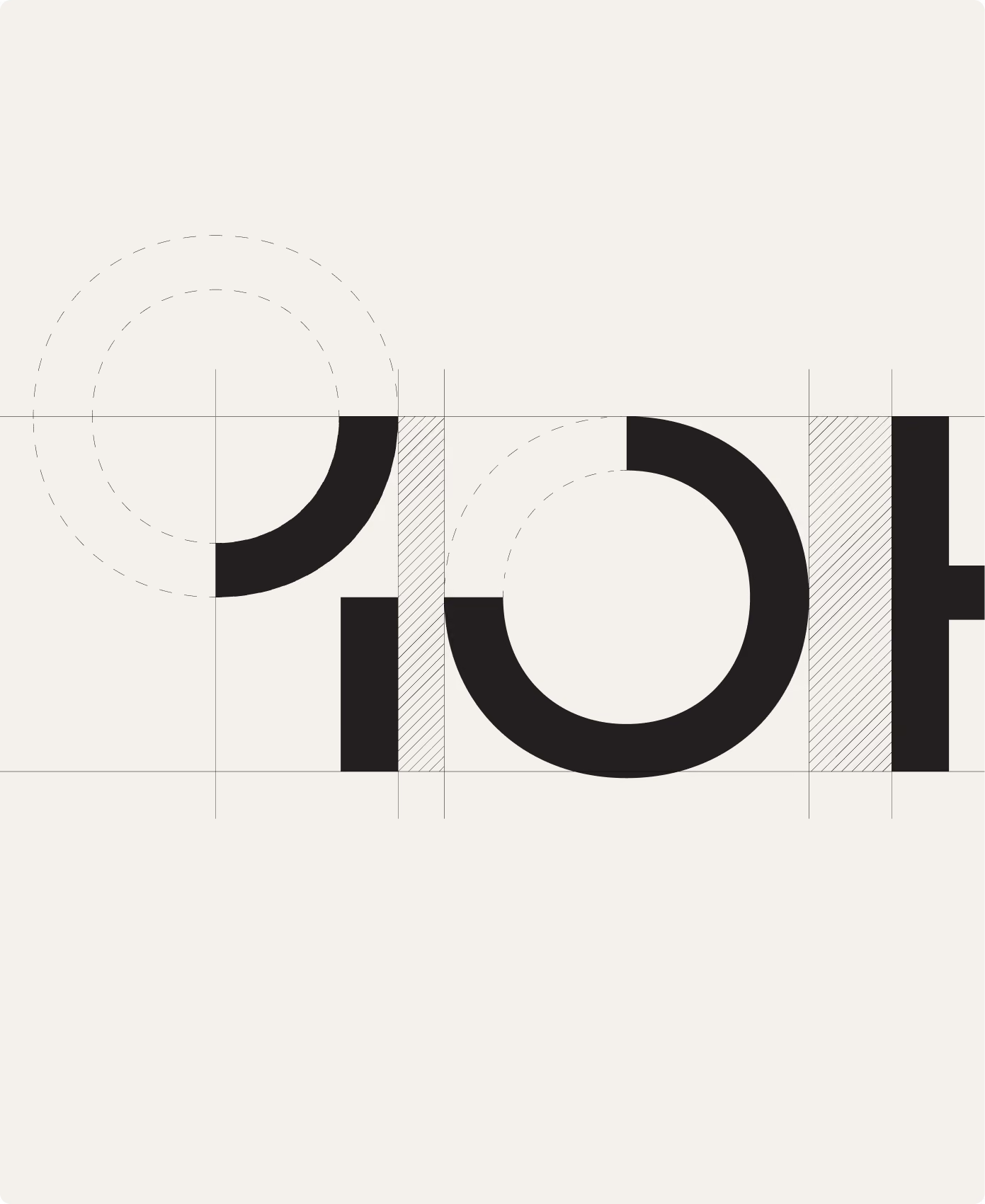
Turning one and zero into ten
I worked through countless fonts, always searching for a one and a zero that carried a certain logo-like character on their own. But the few viable candidates felt either too cliché or too experimental. The logo needed to convey an impression that was elegant and luxurious, yet relaxed.
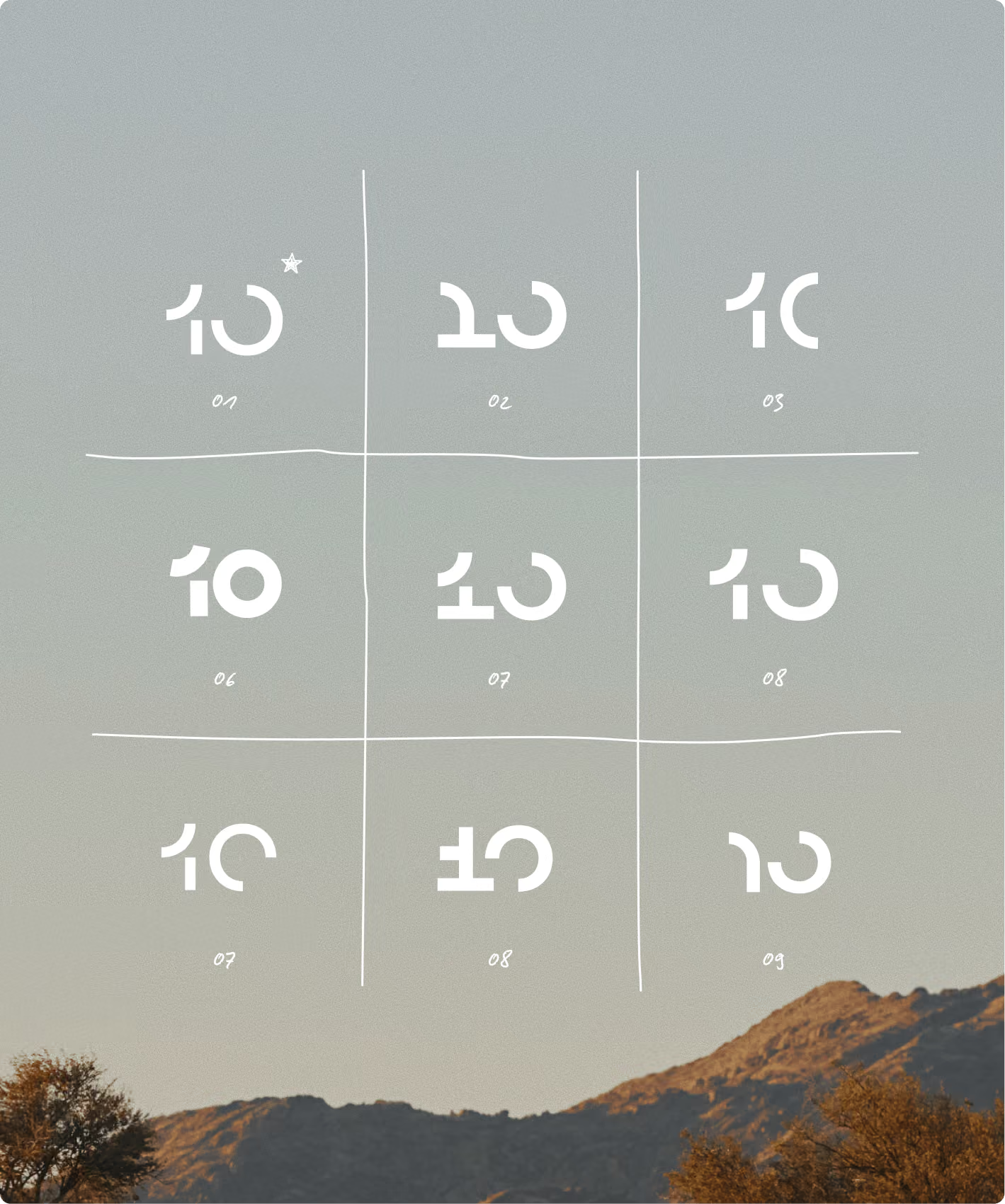
Finally, I reached a decisive conclusion: I had to stop viewing the two digits as a one and a zero and start thinking of them as a single entity. As ten. The necessary impact shouldn't come from the individual characters, but rather emerge from their interaction.
So, I designed numerous variations, experimenting with visual connections and transitions between the two digits. But none of the versions were truly convincing.
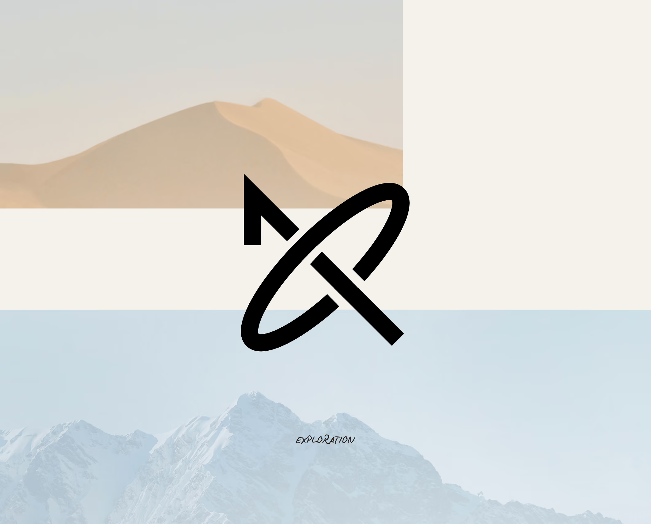
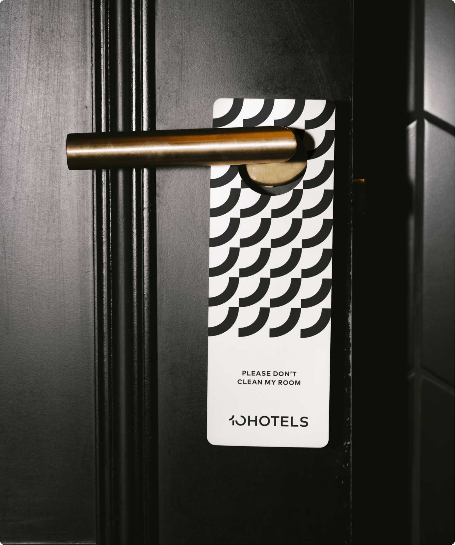
The figurative meaning
Some logos take hours. This one took weeks. When you pour so much time into a single symbol—nearly turning into a computer scientist from all the ones and zeros—the payoff is all the greater when you finally strike gold.
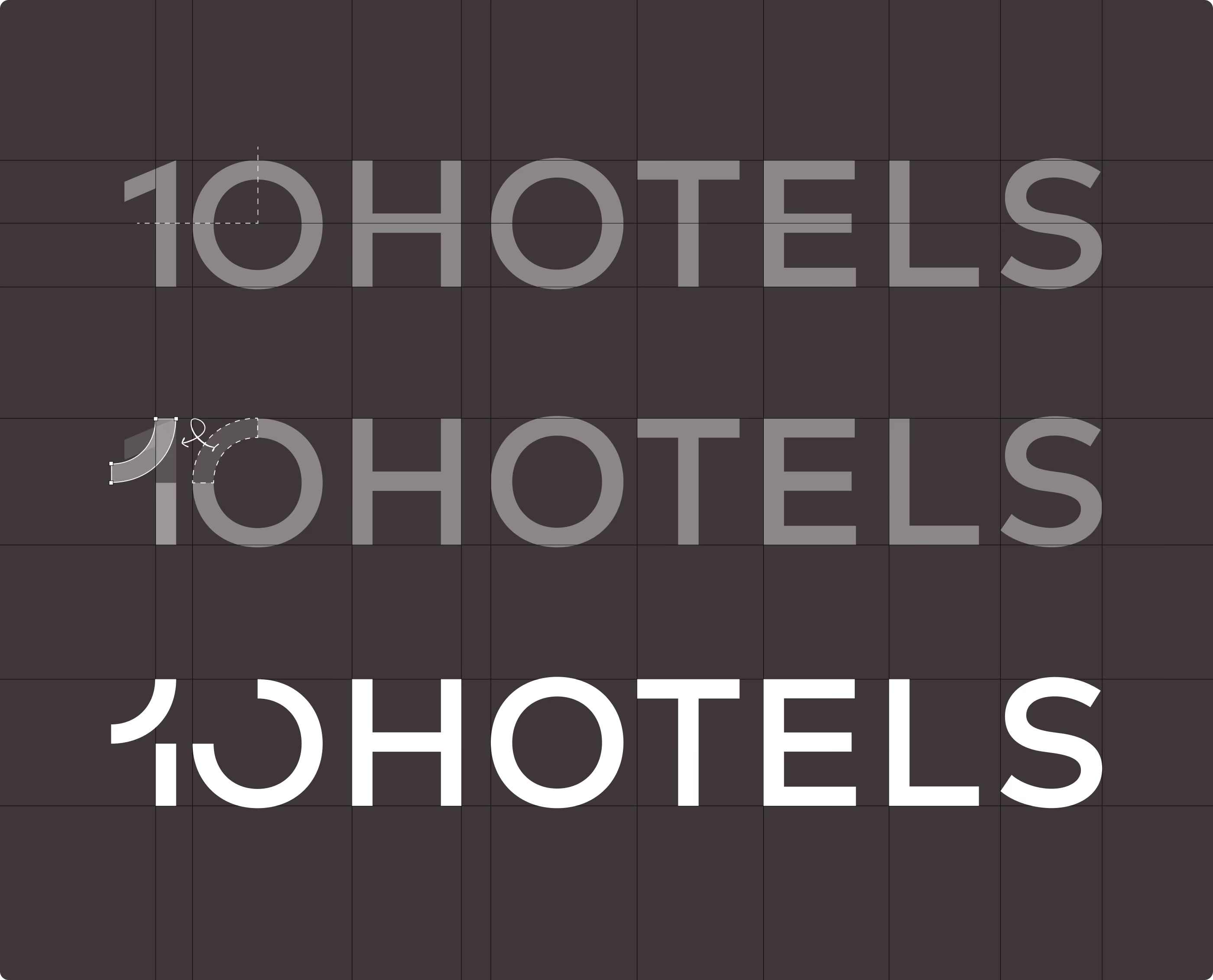
And oh boy, when the idea hit me that the connection between the two digits could be not just visual, but meaningful, the breakthrough finally came. The upper-left quarter-circle of the zero gives rise to the one. It was so simple that I couldn't believe how well the logo worked. I have rarely been so close to a eureka moment.
An effortlessly beautiful logo that, once you've seen it, feels like it could never have been any other way. Completely natural. As if it had been obvious all along.

Nächstes Projekt
A distinctive and timeless logo redesign that gives a renowned car repair shop in Dublin new strength.
