
Crofton Motors
A distinctive and timeless logo redesign that gives a renowned car repair shop in Dublin new strength.
For decades, Crofton Motors has been a fixture in Dublin's automotive industry, offering comprehensive services for all vehicle types and brands. With over 50 years of experience and a team of experts boasting over 30 years of brand workshop experience, Crofton stands for first-class mechanical work and outstanding customer service.
However, the existing logo no longer adequately reflected this quality. The challenge was to unite Crofton's broad range of services in a new, timeless yet modern logo that visually conveys both tradition and trust in the brand.
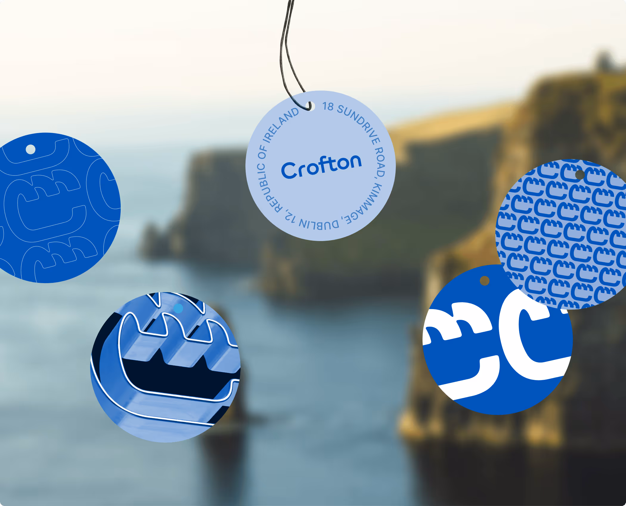
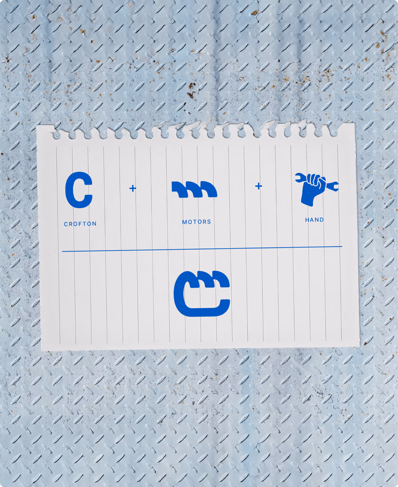
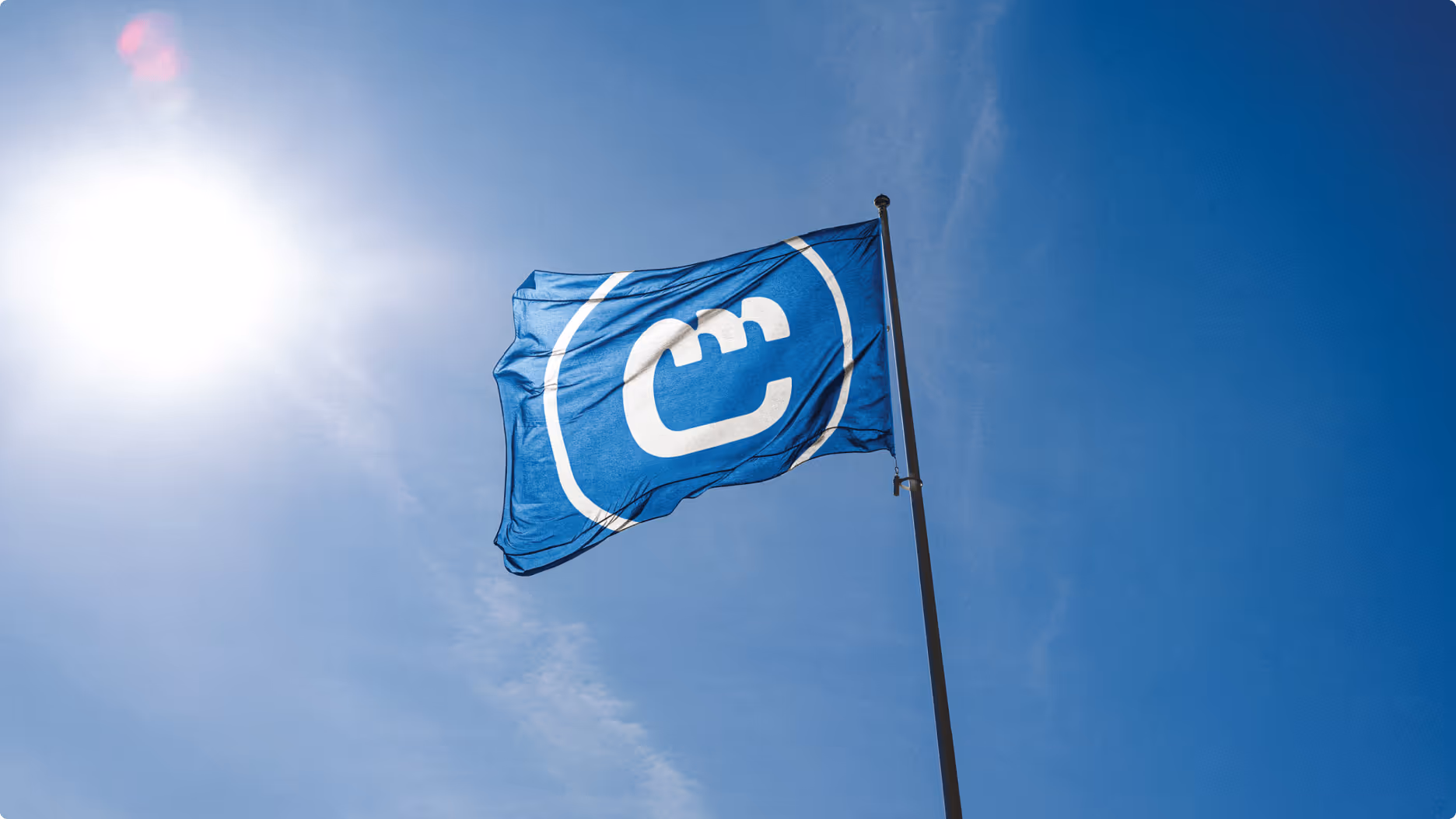
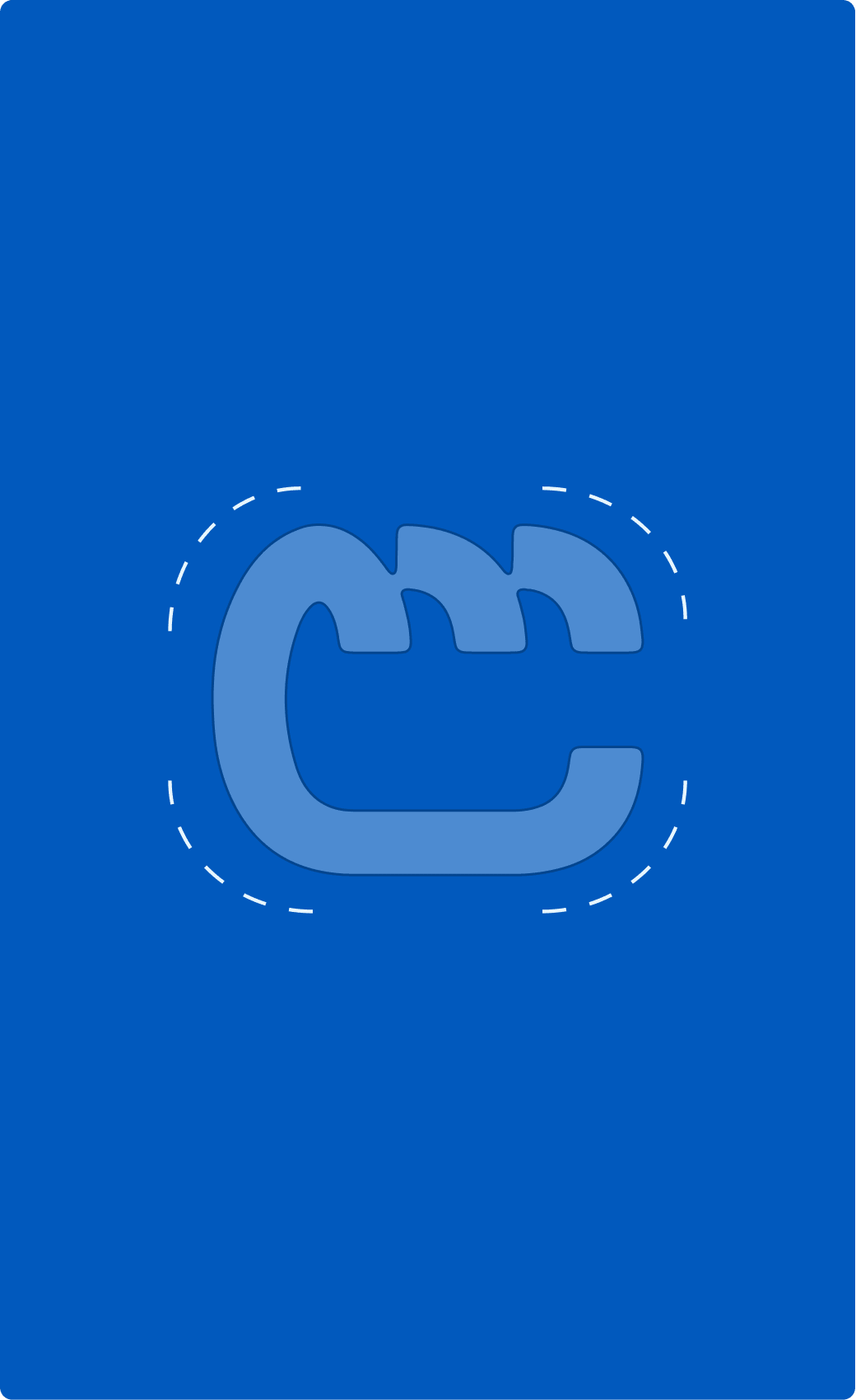
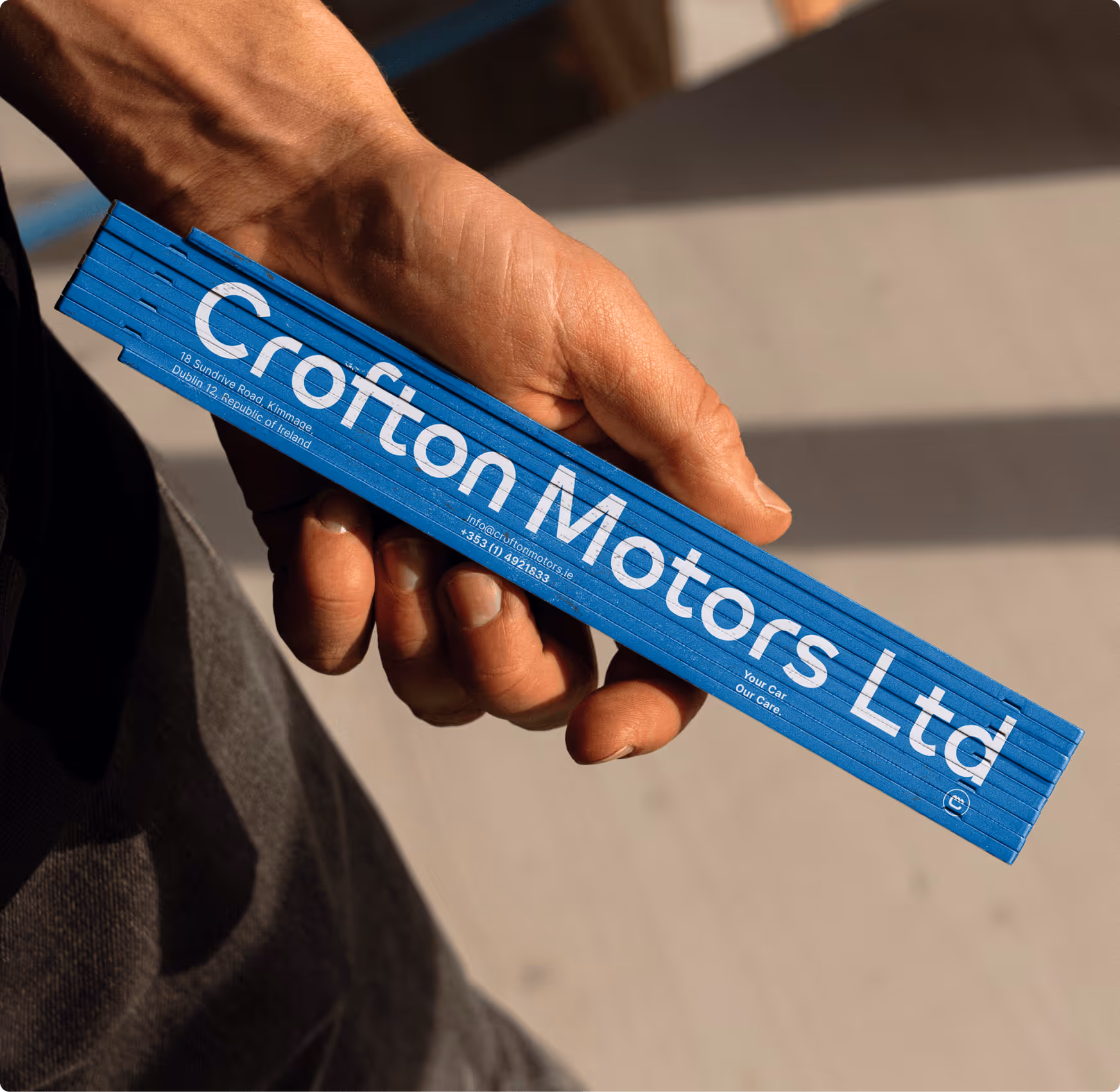
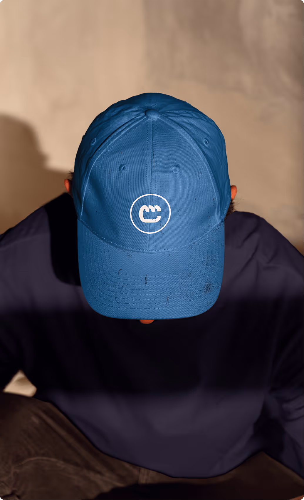
Certain visual elements of the existing logo were to be retained to create a connection to the brand's history: These included the characteristic blue, which stands for trust and consistency, the abbreviation CM, and a blue circle intended to frame the pictorial mark. These components formed the basis for the new design.
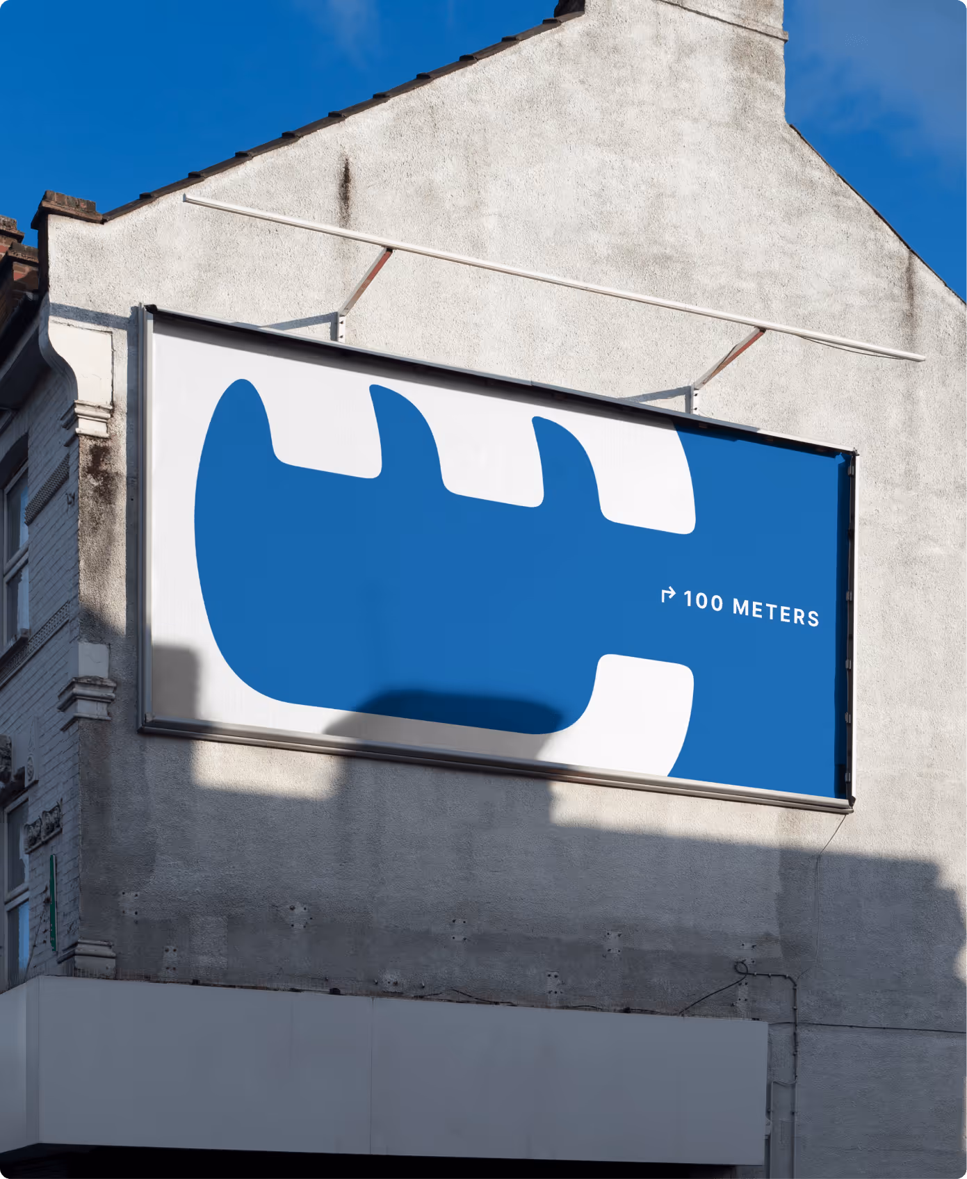
At the heart of the new logo is a distinctive wordmark, strengthened by the development of a CM monogram. This monogram not only serves as a visual identifier but also subtly reflects the craftsmanship and technical expertise that distinguishes Crofton Motors. The lettering itself adopts the rounded and powerful forms of the pictorial mark to emphasize the connection between the pictorial and word marks, while simultaneously creating a strong, visually consistent overall image.

.avif)