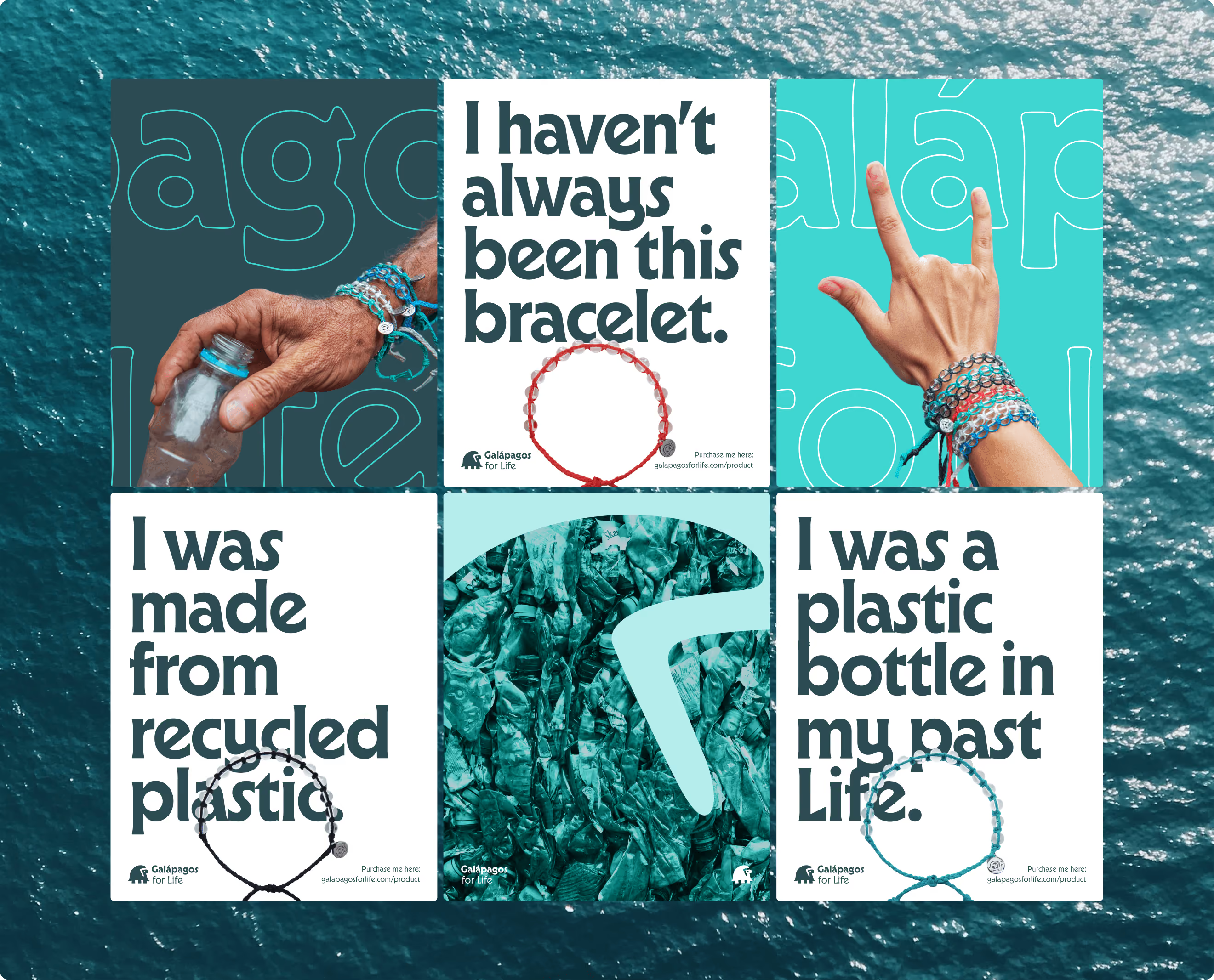
Galápagos for Life
A Turquoise Tortoise for Galápagos.

»Hi there! We would like to renew our visual identity, can you help us? We are @galapagosforlife«
I often get brief requests like this on Instagram, but this one was something special: Galapágos for Life is working to rid the name-giving island group of the trash that washes ashore. Donations and the sale of recycled products fund the mission to preserve this UNESCO World Natural Heritage Site off the coast of South America. It’s a great honor for me to be able to support such a great project pro bono.
As important as their cause is, their brand identity has been rather weak so far. The DIY logo and a loosely defined shade of blue were applied inconsistently depending on the context and personal taste. As a result, a cohesive, recognizable, and distinctive brand identity has never been able to take shape. It’s time to change that.
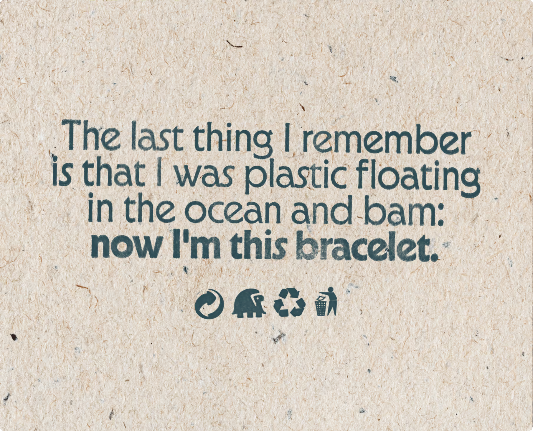
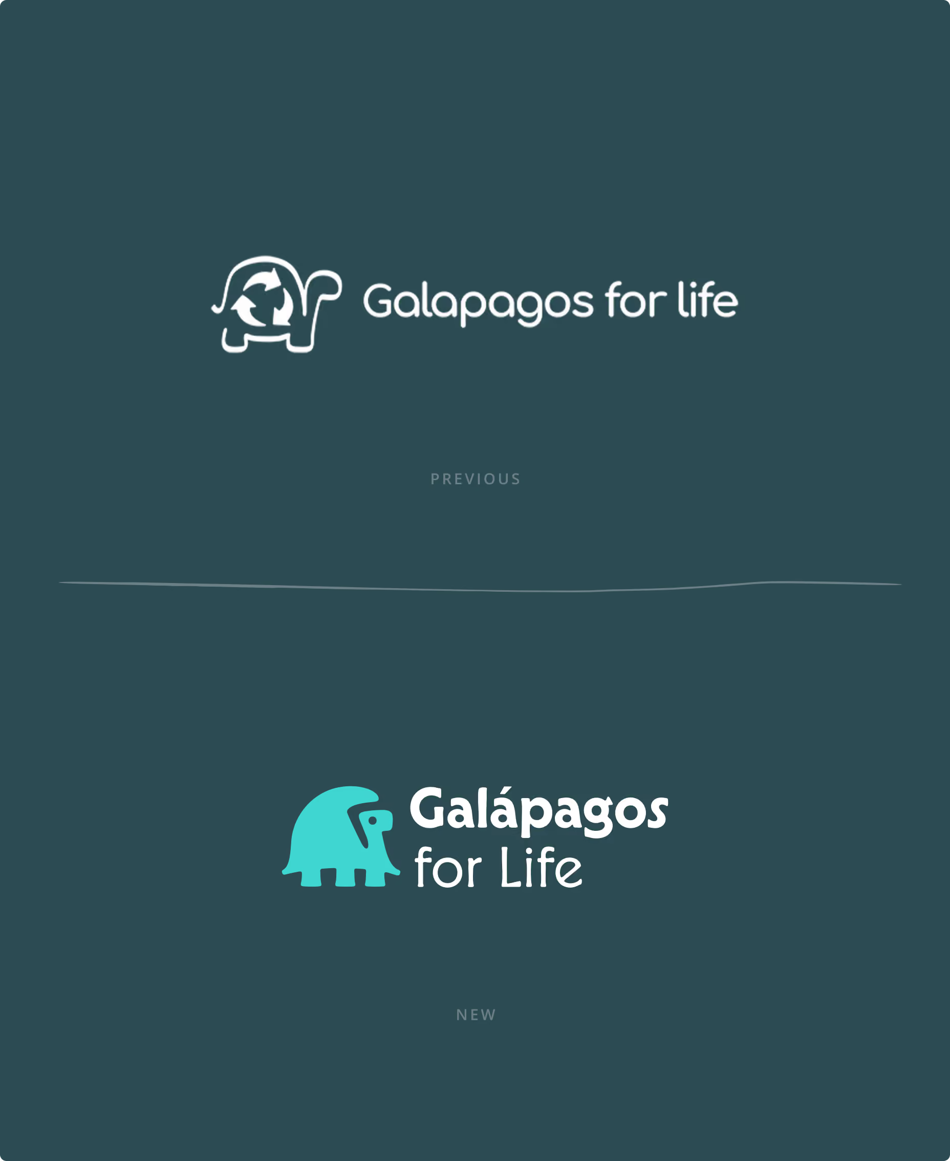

Great responsibility deserves a giant tortoise.
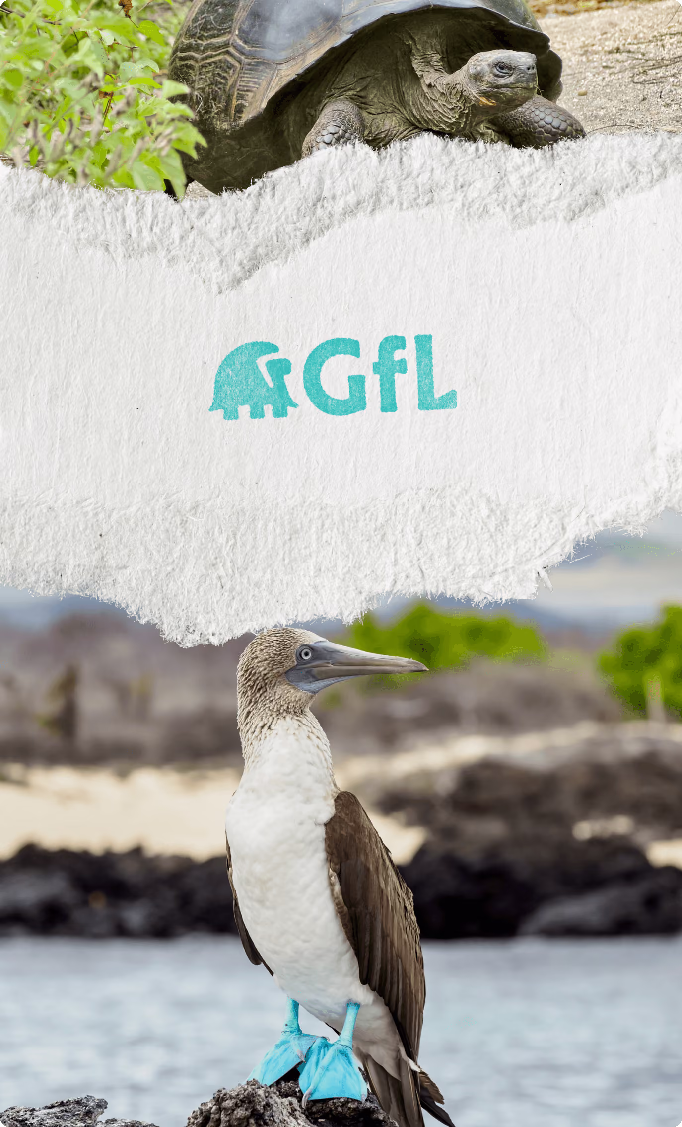
One of the outcomes of the strategy workshop was that the Galápagos giant tortoise—as in the old logo—must be the star of the brand identity. The reptile not only lends its name to the archipelago but is also internationally recognized as an animal ambassador.
After nearly six weeks, 500 tortoise sketches, and countless Adobe Illustrator crashes following this decision, I successfully mastered the challenge of designing the animal emblem. There’s a new tortoise in town: Gilfy!
BelleMer (French for “beautiful sea”)
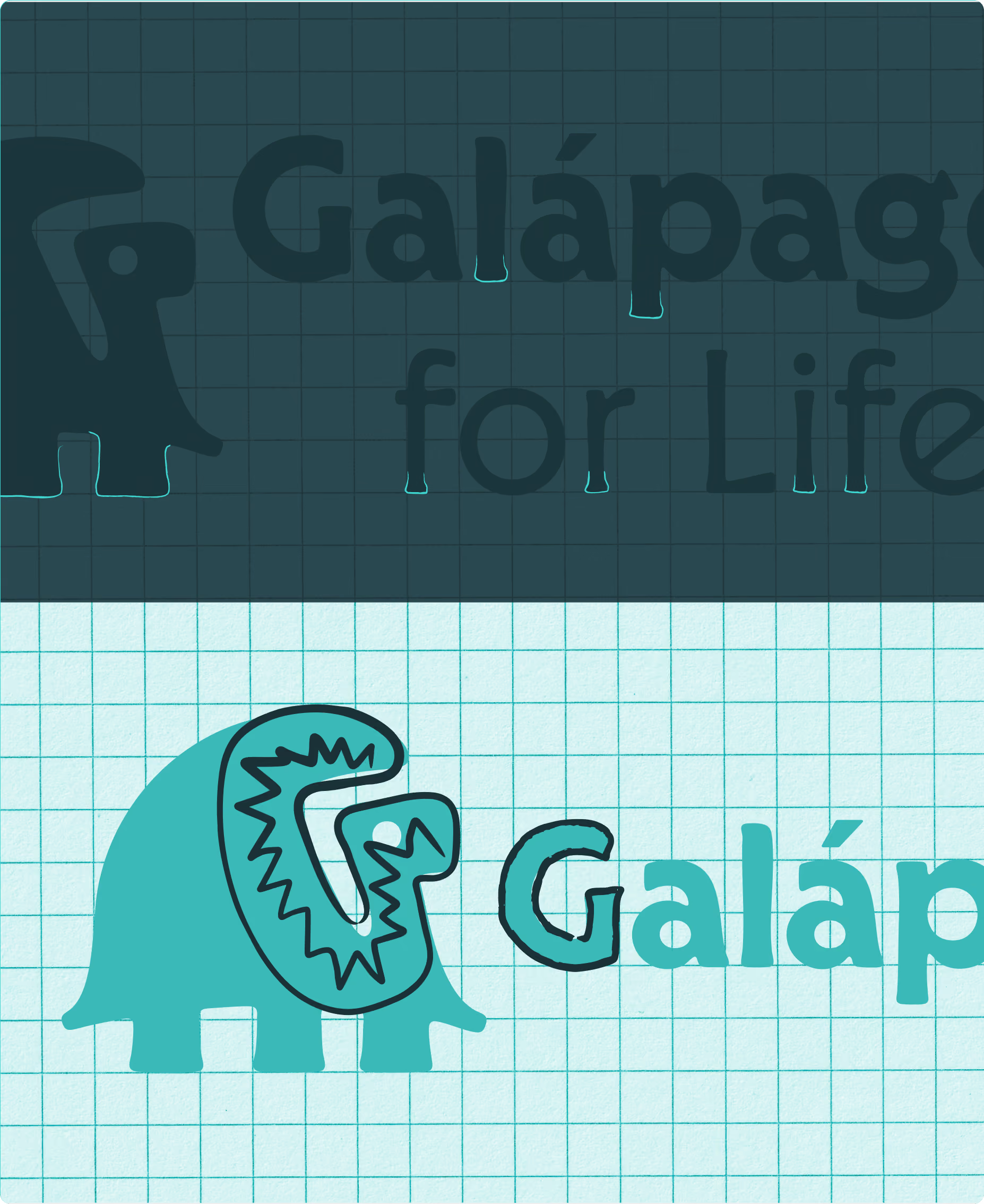
Even while working on the logo design, I was on the lookout for a suitable typeface. The tortoise logo needed to resemble the “Galápagos for Life” lettering so closely that it would seem as though it had always been part of it. My search led me to BelleMer from the Berlin-based type foundry HvD Fonts. The deciding factor was the stems of many letters, which resembled the turtle feet I had designed. After some microtypographic adjustments, all the elements came together to form a single logo.
As little as possible, as much as necessary
Andres—the friendly CEO who contacted me with the message above—has a basic understanding of design software. However, since Galápagos for Life does not have its own marketing department and all design elements must be easily usable even by non-creatives, I developed a intentionally minimalist, practical design concept.
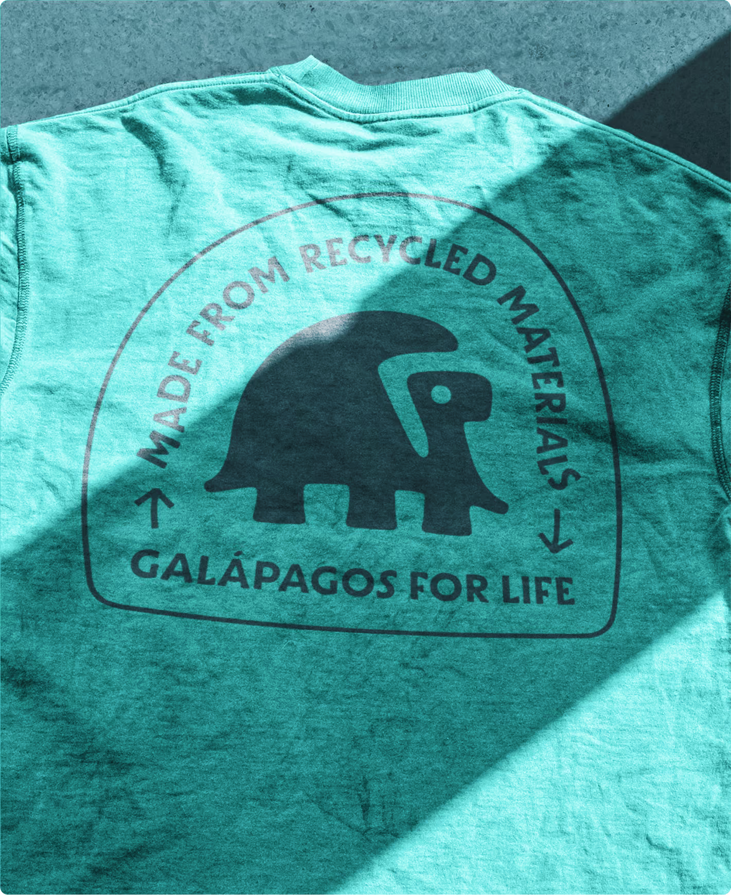
Accordingly, the impact of BelleMer should not be limited to the logo lettering alone, but should extend as the corporate typeface to the entire visual identity. For body text and small typographic applications, the more readable, open-licensed Open Sans is used, which resembles BelleMer in its basic characteristics.
As the core palette for the color scheme, I defined a dark petrol blue and the highlight color Turquoise Tortoise. Both shades can be reproduced almost identically in print and digital formats and, when combined, offer—as we found—a high level of brand recognition.