Mitcomm
A striking, dynamic brand on Europe's gray concrete streets.

Often, the first idea isn’t the best.
Especially when it comes to logos, it’s worth investing a lot of time in the ideation process and exploring different approaches. The Mitcomm project was probably destined for success, because what you see here was actually my very first idea. And it was a hit right away.
But even the best first idea is only truly the best if you can compare it with other similar ideas.
But wait! What does Mitcomm actually do?
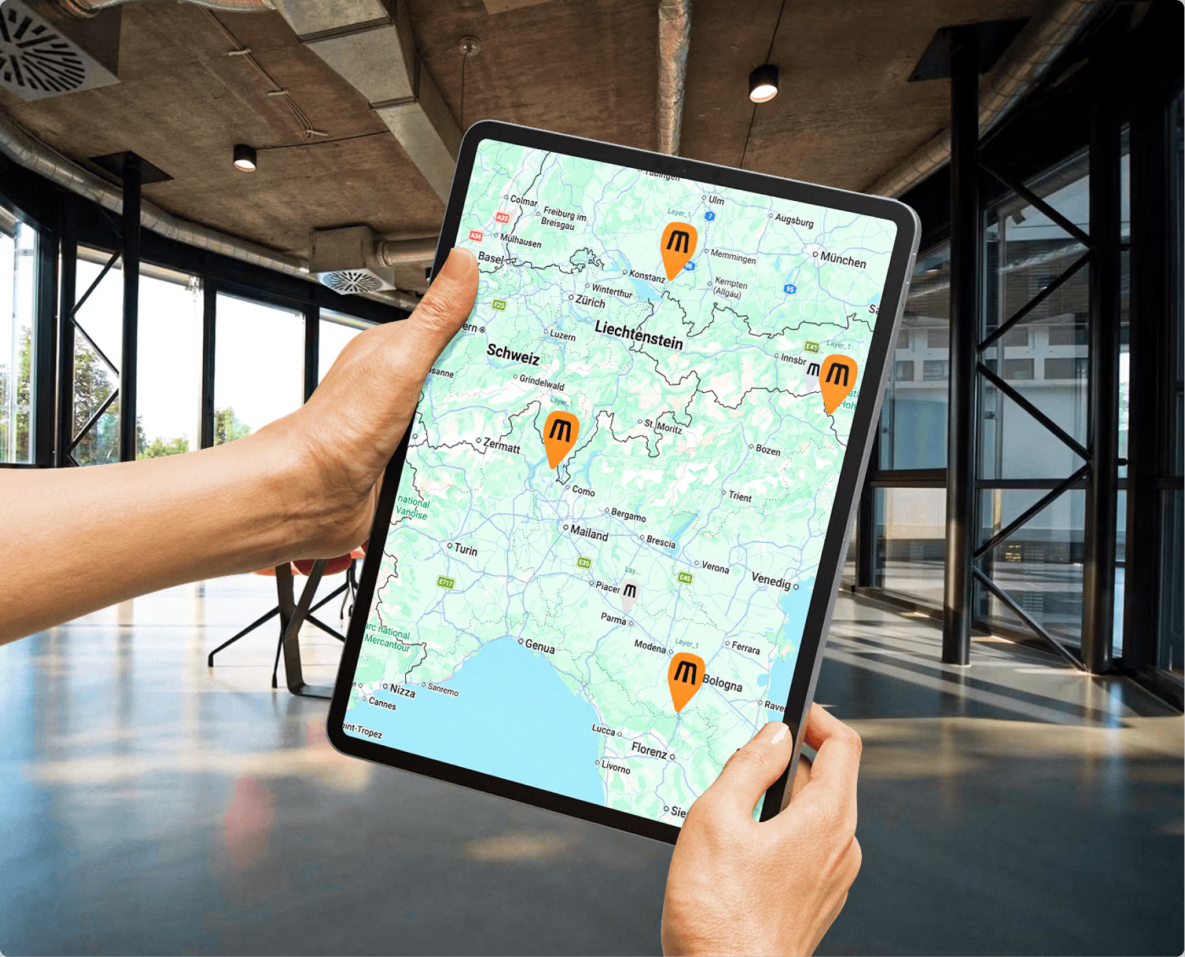
Its customer base consists primarily of freight forwarding, logistics, and trade companies. Many of them have an entire fleet of trucks equipped with Mitcomm’s tracking solution. The associated hardware enables these companies to keep track of all their vehicles and to plan and coordinate assignments as efficiently as possible. The whole thing is called telematics. The term is a combination of telecommunications and informatics and describes the connection between the two fields to capture and exchange information over distances.
New Name, Same Service
During the strategy workshop with the client, it quickly became clear: We needed not only a new logo, but also a new name.
For many competitors, the name is made up of terms like “fleet” or “telematics.” Visually, truck and pin symbols dominate. The result is an industry where many brands are virtually indistinguishable from one another in terms of concept and design.
That’s exactly what we want to set ourselves apart from.
So we’ll start with the name. It should capture the essence of the company’s services without limiting it to a specific business area. Mitcomm, a combination of “Mit” (german for "with") and “Communication,” was born. The fresh, German-English name is short, catchy, and memorable. At the same time, it leaves room for potential international expansion and future business areas.
With a name like this, it quickly became clear to me: We don’t need an additional symbol. The name itself is strong enough to become the visual brand. It is the heart of the identity and should therefore also take center stage in the design.
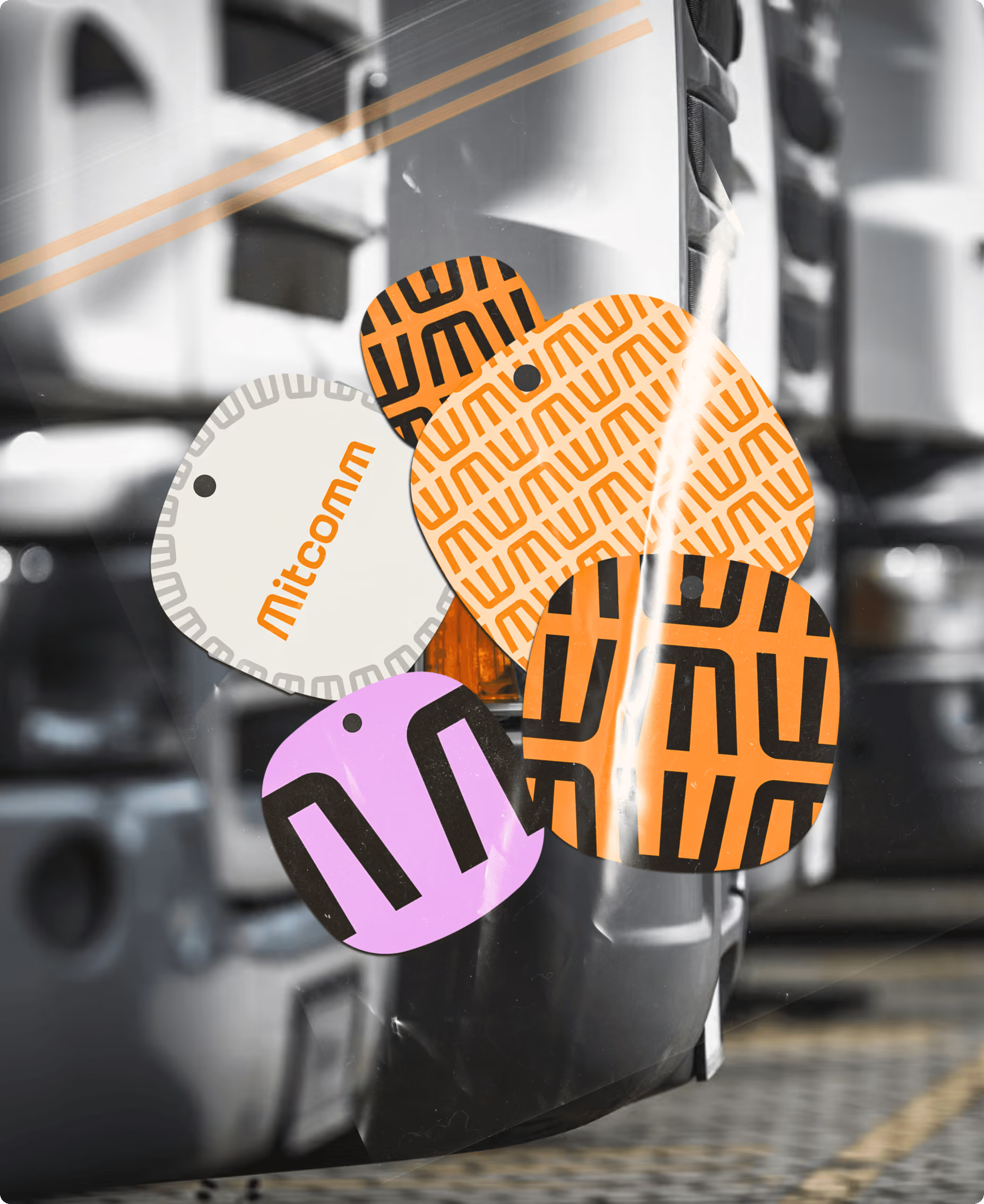
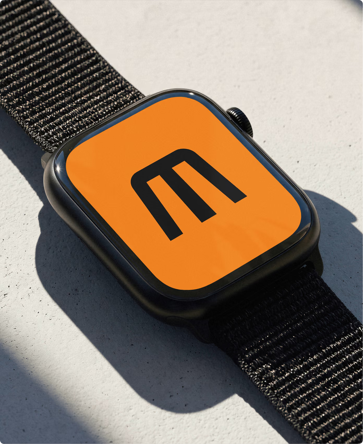
Every brand should be designed from the start to function seamlessly in everyday life. That’s why I wanted to provide Mitcomm with a compact version in addition to the full logo. After all, especially online, you often need a square version—for example, for profile pictures or other applications in the 256 × 256-pixel format. This ensures the brand remains recognizable there as well.
So the plan was clear
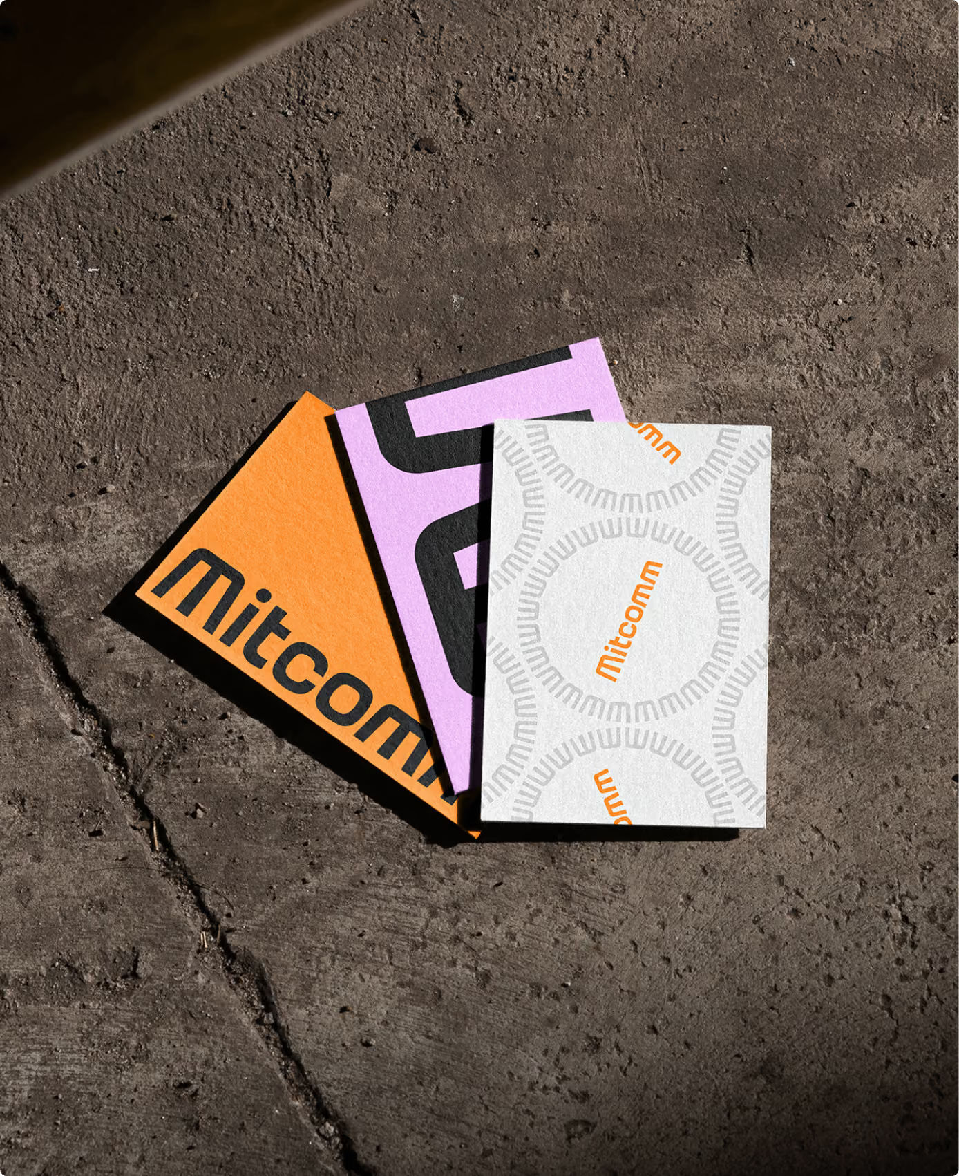
A slightly eye-catching “M” as a short mark and a conceptually designed wordmark for “Mitcomm.”
The latter is always a bit of a balancing act. On the one hand, the “M” can’t be too striking, so that it blends harmoniously into the name and doesn’t look out of place. On the other hand, it mustn’t be too generic either, because ultimately it’s meant to function as a standalone logo.
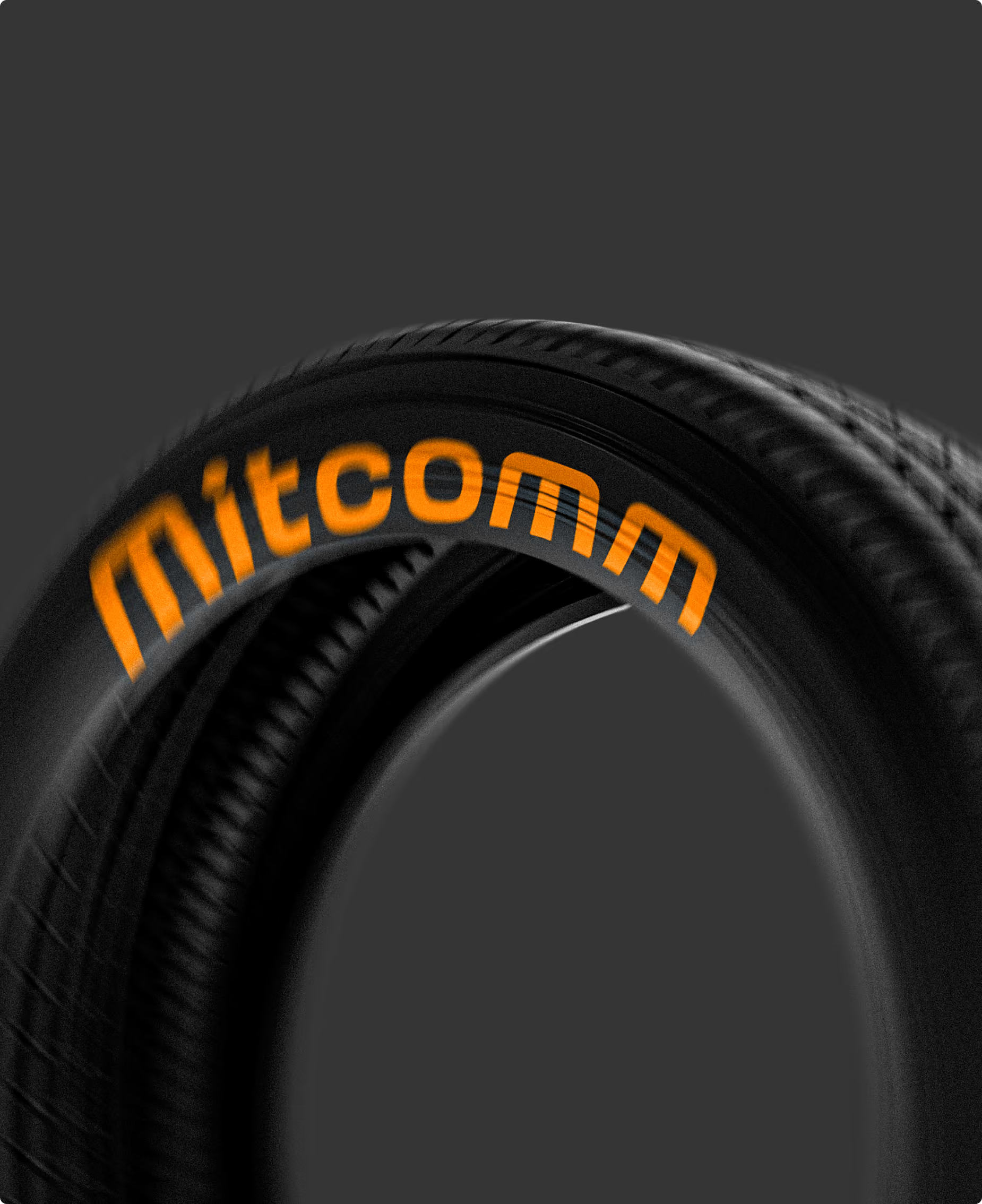
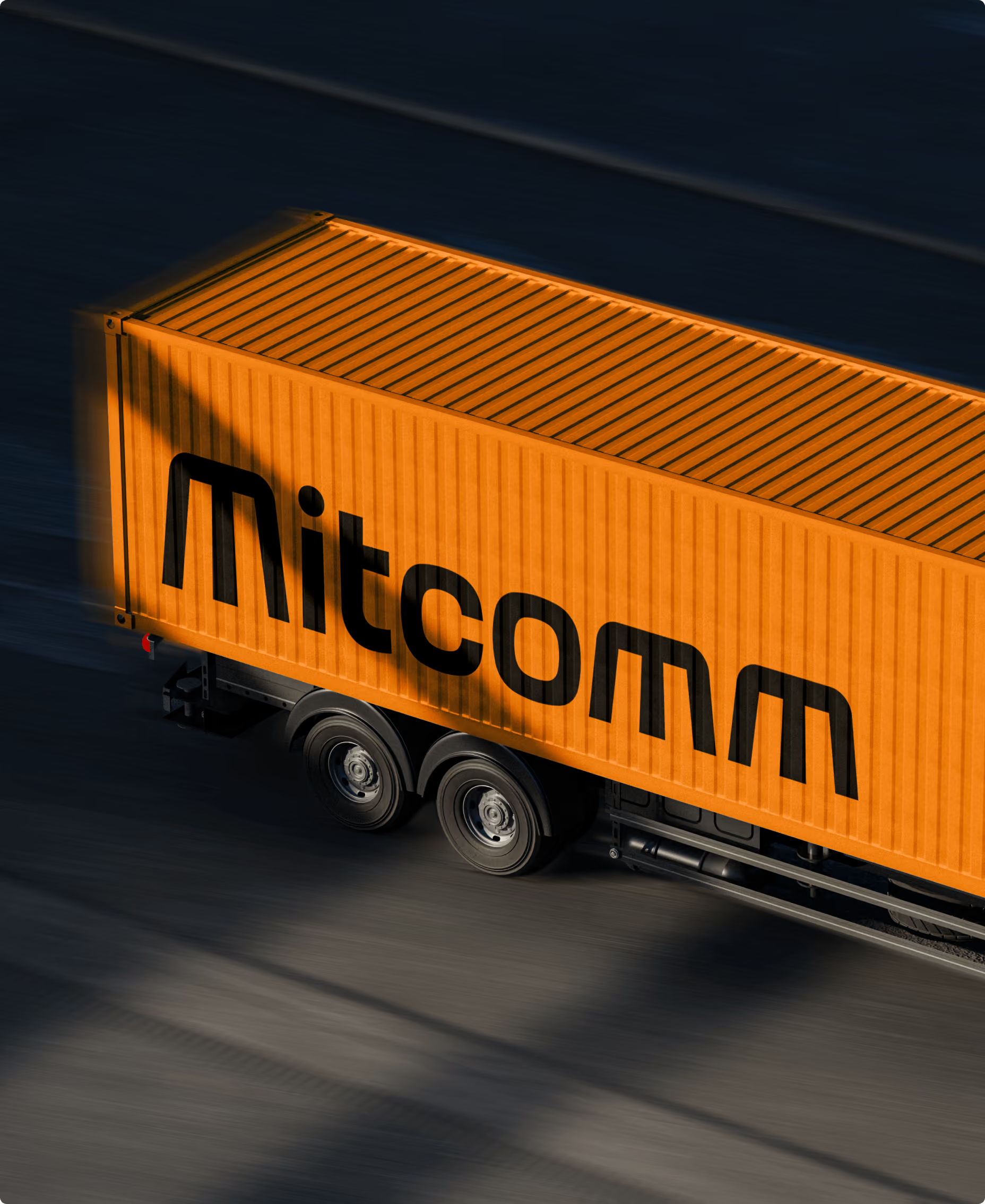
My design concept is based on the alignment lines of a highway, which served as my guiding principles for the design. Instead of constructing a rigid grid, I aligned each letter individually with this concept. The principle remains deliberately subtle. The fact that the “M” appears three times in the name naturally worked to my advantage from a design perspective. Thanks to the consistent alignment of the letters, the entire wordmark appears very cohesive, while the “M” still emerges as the true star.
A nice side effect: Many people recognize the “M” as the headlights of a truck. Sometimes, everything just falls into place on its own.
Orange is the new yellow
In terms of color, we initially wanted to stick with the established yellow. After the name change, however, I advised my client against it. Because even though our “M” has a completely different design, a yellow “M” is already strongly associated worldwide with a certain fast-food chain.
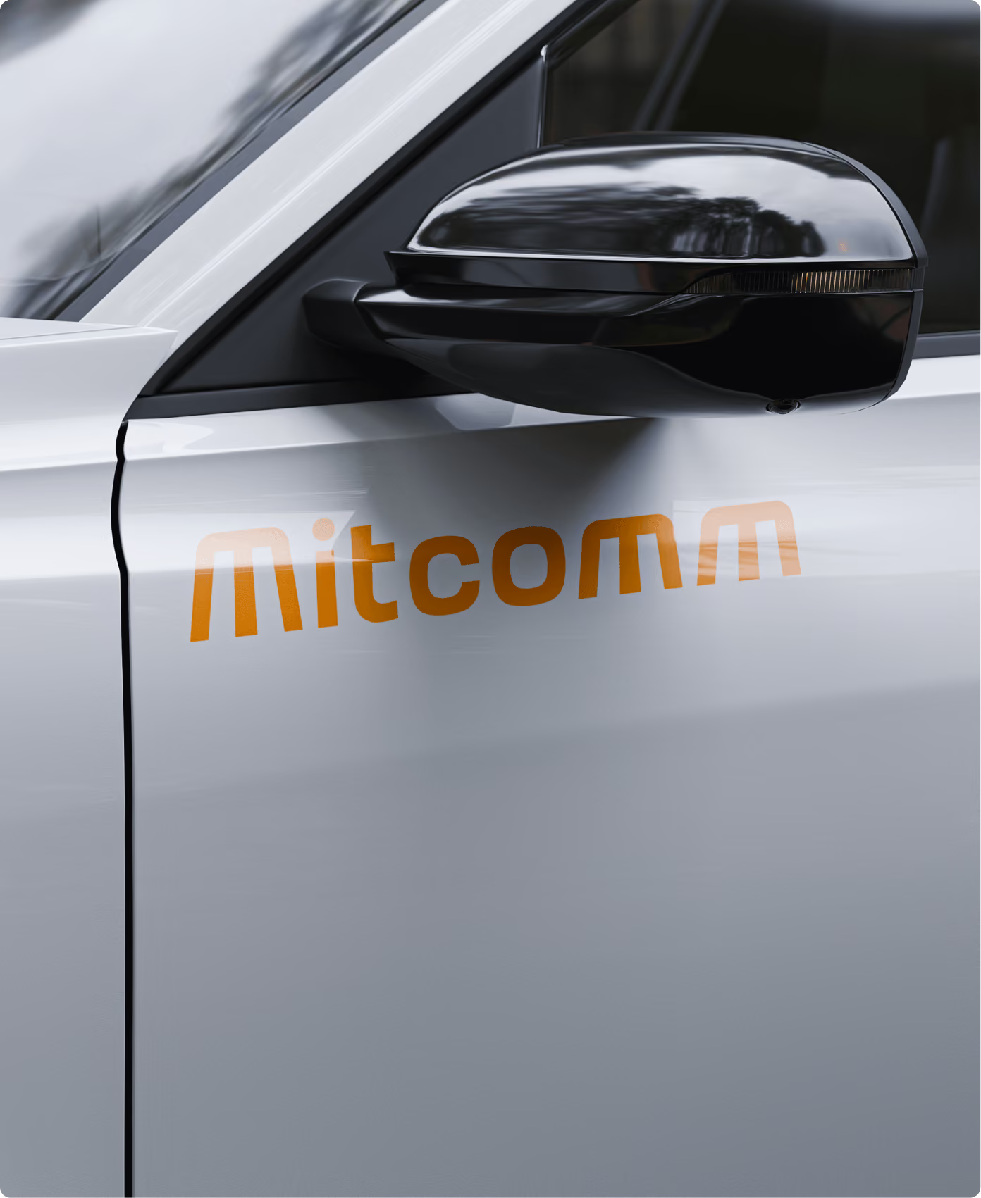
So instead of just refining the name and logo, I also wanted to completely revamp the color scheme. The result is a vibrant orange that really stands out against the gray concrete streets of Europe.