JF Brandschutz
A refreshing brand identity for a dusty industry.

“As a passive fire protection provider, we’re like a building’s airbag.”
That sentence really opened my eyes. Unlike active fire protection, JF Brandschutz (JFBZ for short) has made it its mission to prevent fires from spreading through preventive measures. The team led by Jonathan and Felix wants to bring a fresh, youthful energy to this outdated industry.
They had already identified the challenges for the brand and logo design themselves: “You’ve never bought a car just because of the airbag.”
A Smiling Shield as a Symbol
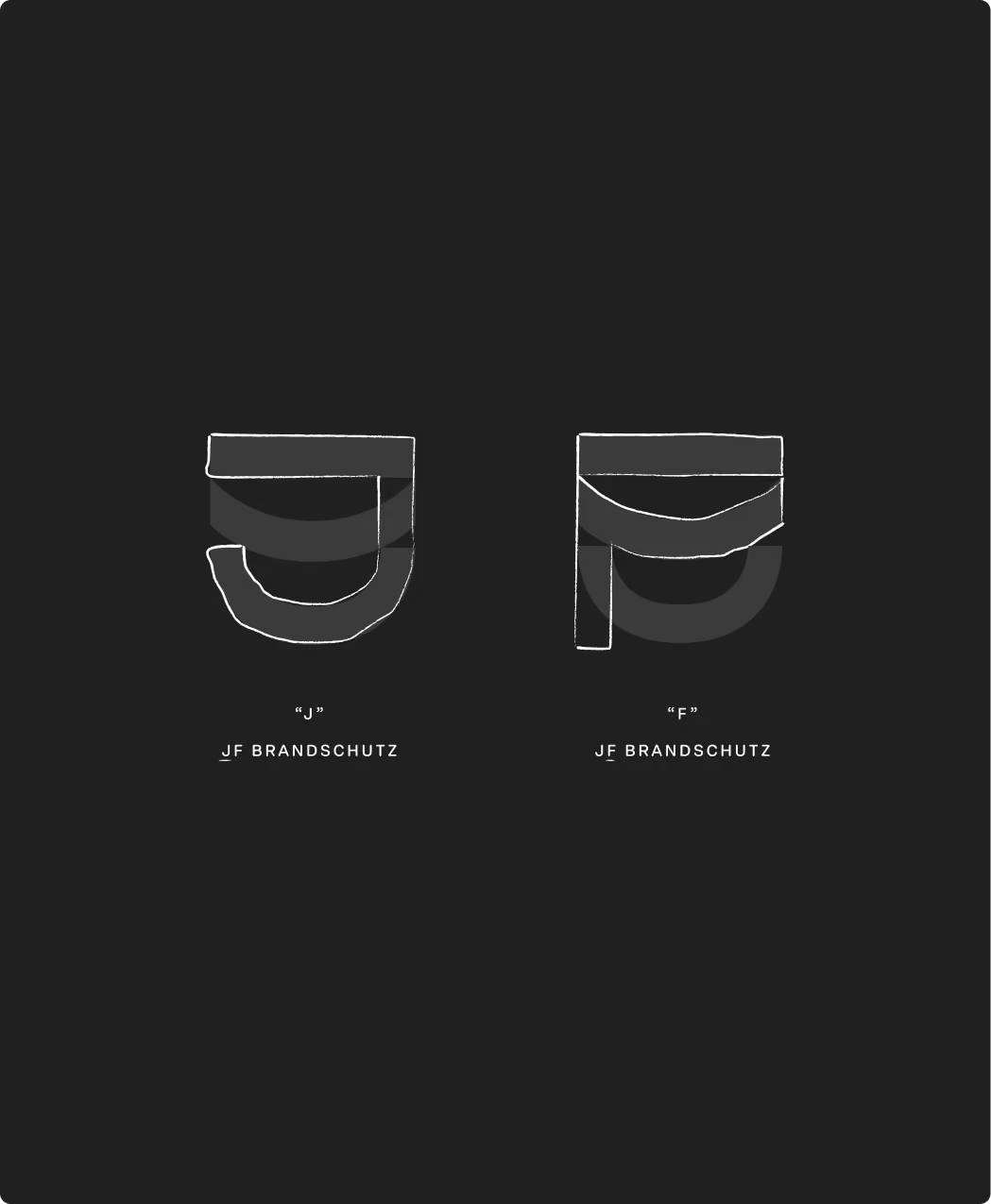
What symbols do you associate with fire protection? A flame, water, or a shield? So do we. But since passive fire protection has little in common with active firefighting, the shield was the obvious choice.
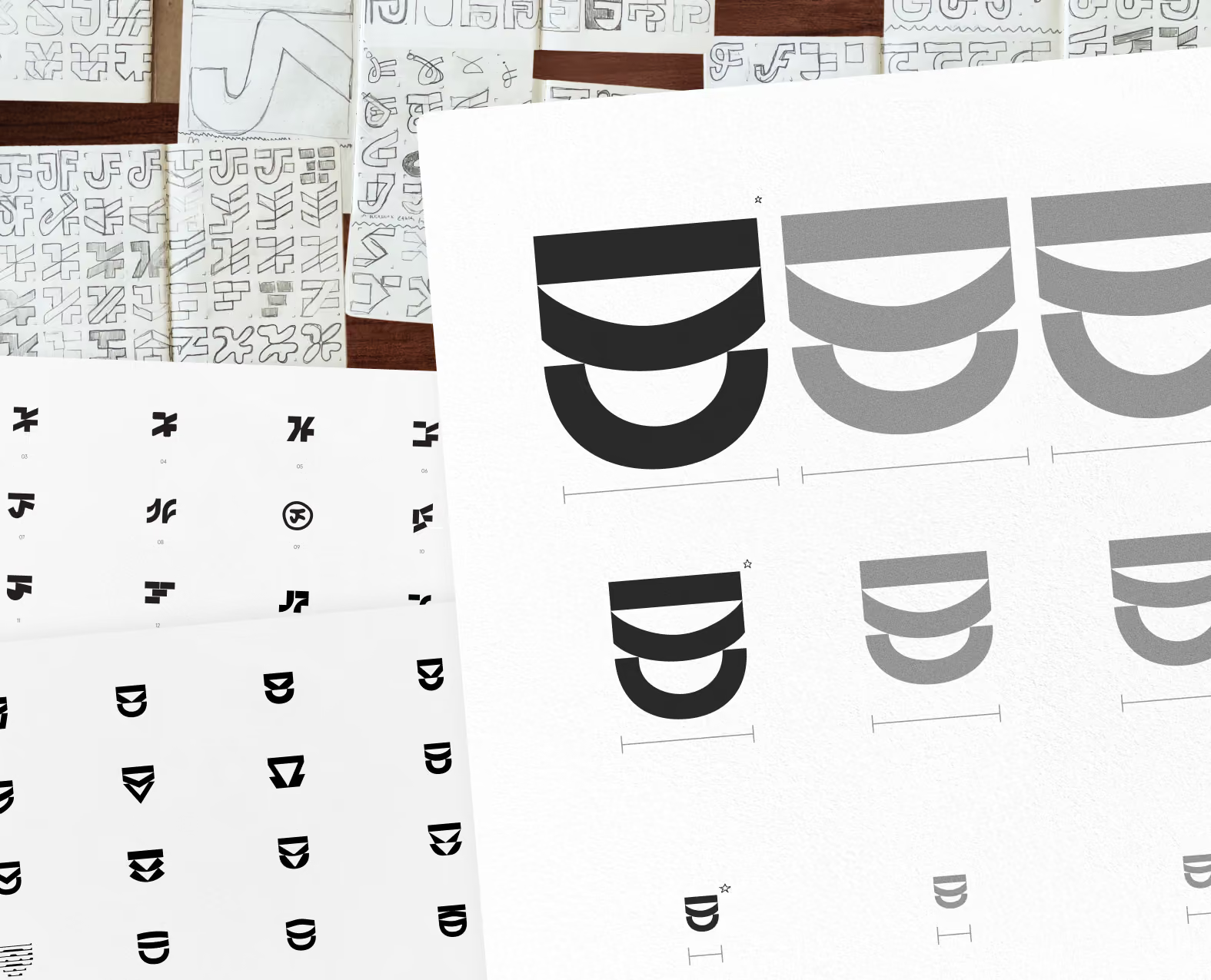
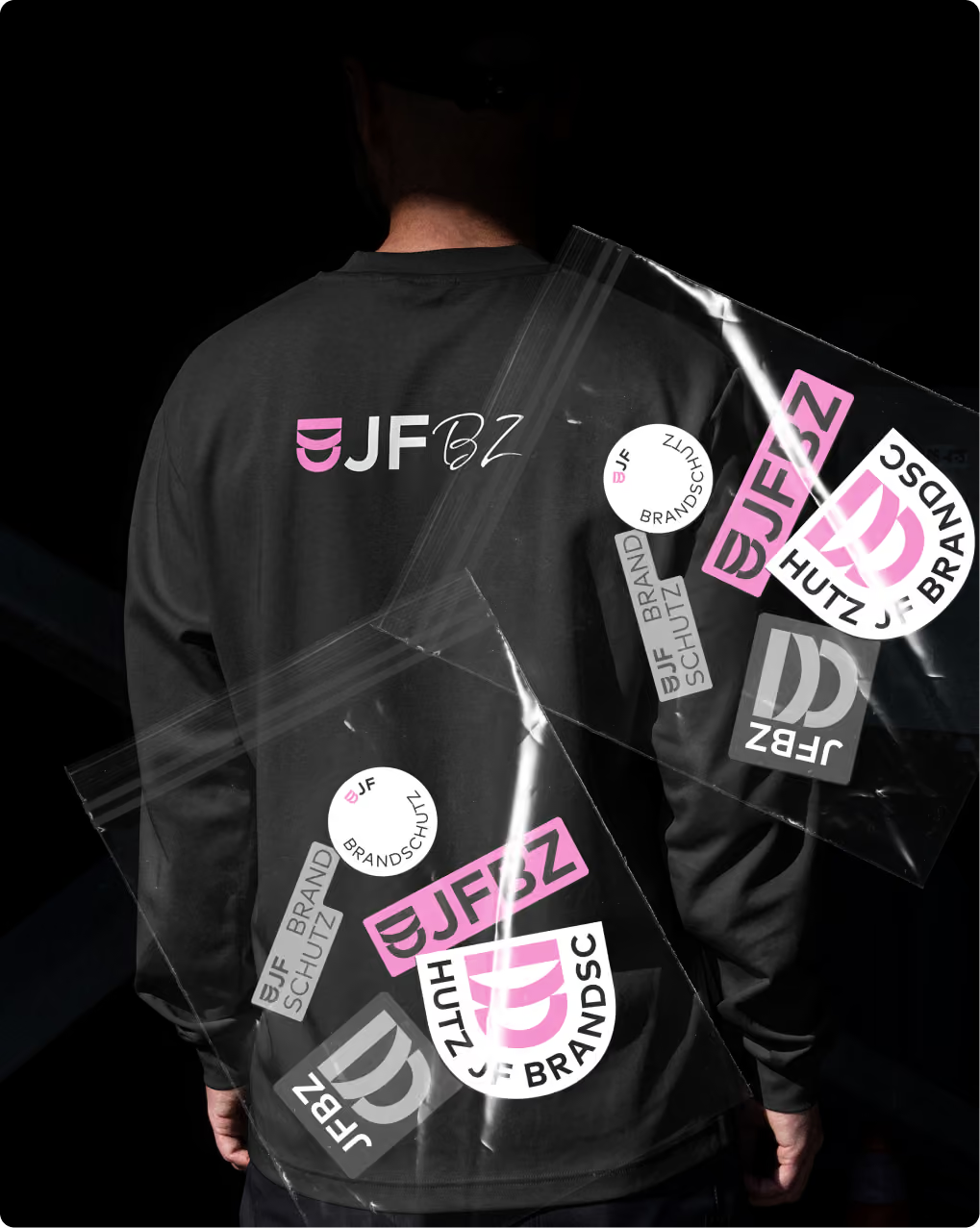
So the brief for our logo is clear: a shield that’s also a JF monogram. However, creating a JF symbol on its own turned out to be a bigger challenge than we’d initially thought. Even after many pages of sketches, many designs looked clunky and didn’t seem to fit. After some time, though, I was able to untangle this knot.
The pink elephant in the room
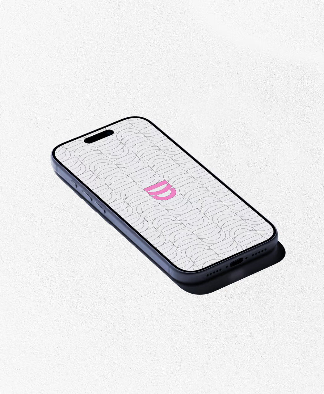
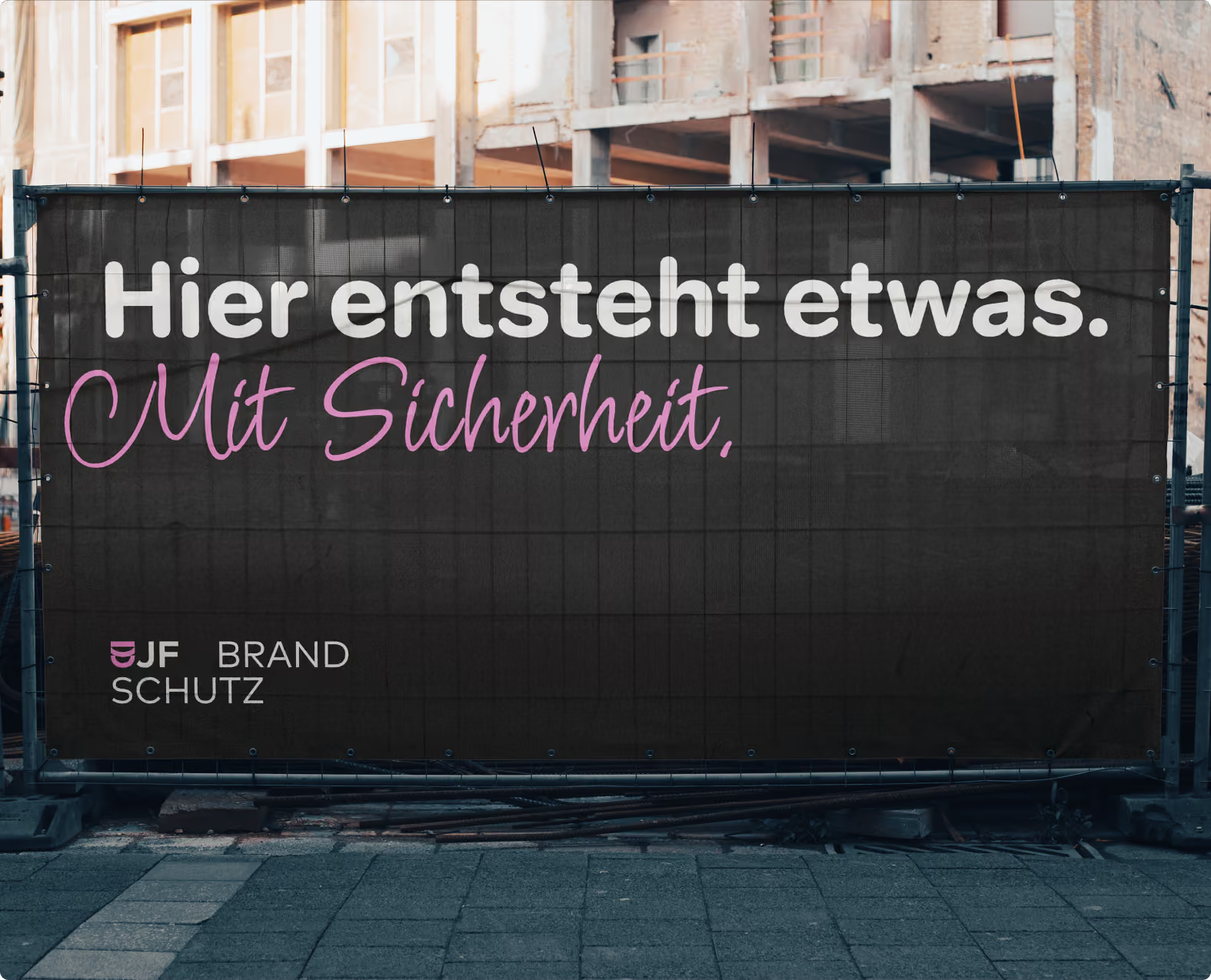
The market is oversaturated with red fire safety companies, and we won’t be one of them. Our approach was to subvert this overused color—with pink.
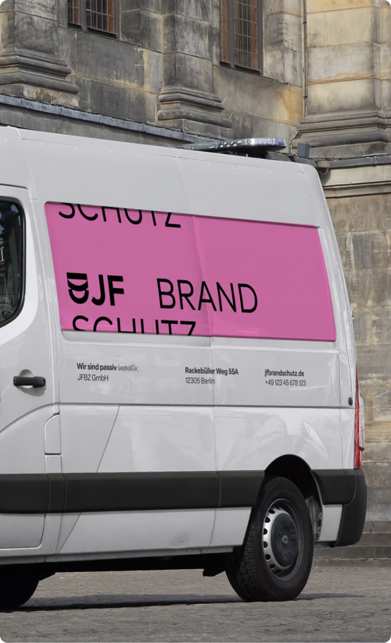
For the industry, pink is a refreshing change. Our rather traditional-looking shield logo screams “we’re part of the industry,” and our pink says “but we’re not like them.”
“90% Serious, 10% Cheeky”
To stay true to our strategy, we’re turning our backs on traditional fire safety design elements. Not because we’re desperately trying to be different, but because we asked ourselves, “Does fire safety have to look like this?”
Does the brand typeface have to be angular, sharp-edged, and hard as nails? Aren’t those qualities more likely to be associated with fire?
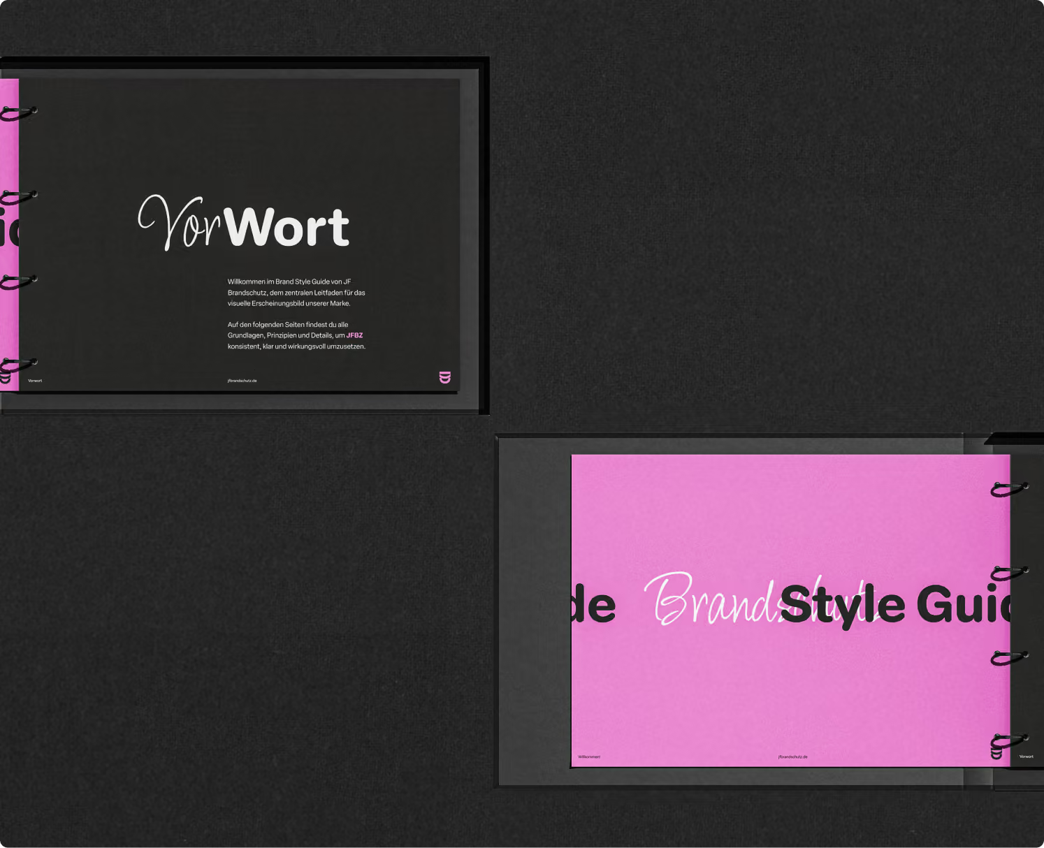
JFBZ should embody exactly the opposite: round, trustworthy, gentle. A typeface that reflects this is Elza Round from Blackletra Type Foundry.
We also need a typeface that reflects the human, warm side of JFBZ (“10% cheeky”): the Licorice typeface by Robert Leuschke.
Left, right, top, bottom. Left wall, right wall, ceiling, floor.
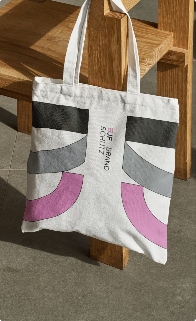
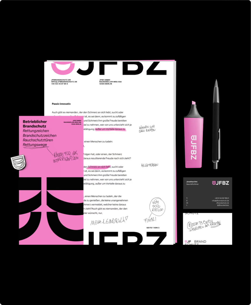
JFBZ primarily works on waterproofing ceilings, walls, and floors. This framing of spaces is reflected in the design.
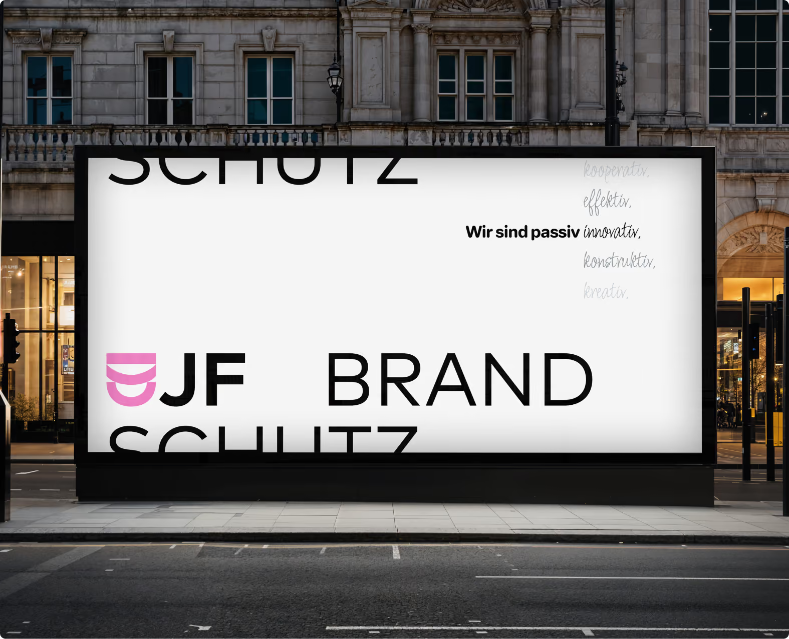
What sounds rather understated in theory is an absolute eye-catcher in practice: a cropped logo, broken-up sentences, and images that extend beyond the borders.